Tuesday 20 December 2016

BRIEF IN A DAY; Love Glove

The Client; 

  • Izzie Glazzard
  • Graphic Design student @ LCA

The Brief; 
  • Hey , i'm putting together a queer/LGBT+ arts and culture magazine and i'm looking for some illustrators to collaborate in creating some satirical adverts. I have a few ideas so far and am just looking for some talent to execute them for me. The ideas so far are...
- Finger condoms/latex gloves for lesbians
- U-hall van hire
- Vitamin D
- Nike - Dyke
- Lesbian manicure service - to cut and clean up nails rather than add falsies
- Gay conversion therapy - to make straight people gay
- Cock engagement rings
- Coming out cake makers
I'm completely open to any other ideas and would love you to get involved. Lemme know if your down.
 
Iz
                    The Rationale;

                    • I was contacted by Izzie (who I worked with last year on responsive D&AD brief) about making an image for her queer/LGBT+ arts and culture magazine as a part of her COP practical work. This kinda came out of the blue but I really liked the idea of getting involved. I've enjoyed working with Izzie in the past, and this seemed like a really quick turn around brief that would be a bit of fun in between all the current COP stress I was dealing with in my own project.
                    How it went down
                    • I asked Izzie if it'd be cool for me to do the finger condoms for lesbians image. I'm an absolute sucker for puns and I had a ton ready for this image. I also really liked the half funny half satirical notion the image implied. 
                    • Having being around Izzie's work for some time I know she's a fan of bold graphic design and block colour, so I decided to incorporate bright colours into my own image.
                    • Given that her magazine was so inclusive (and that I'd been filling myself up with inclusive knowledge for my own COP) I also chose to make the central hand of the image a skin colour other than white, as an attempt to include queer/LGBTQ+ women of colour also
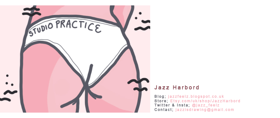
                    Examples of Izzie's work
                    • My main intention with this brief was just to have fun with it, and try out some quick digital work in between all the analogue stuff I'd been doing. I tried to stick with the fun and ridiculous notion of finder condoms for women, and I think that shows in my final piece. Izzie was really happy with it, and it gave me a nice break from my own COP for a few hours. Don't forget to wrap ur members ladiez!!!
                    Final Illustration

                    Image on Izzie's Insta

                    Tuesday 13 December 2016

                    BRIEF IN A DAY; La Bete Blooms 'Low Hummer' Storyboard

                    The Client;

                    • La Bete Blooms

                    The Brief;

                    • Meet with Dan and run through his storyboard proposals for La Bete Blooms newest single 'Low Hummer'. Dan has already taken the time to sit down and plan each scene to the second, but needs someone to visualize and storyboard it for him so he can take it to his videotographers. 

                    The Rationale;

                    • I've kind of become the visual artist for La Bete Blooms during their 'I Know It's Nothing' EP run. As such Dan has come to me with this brief. It's not one that I really need to finish with a high level of craft or style, but one in which my skills as a visual storyteller are most needed. I must be able to translate what Dan is telling me into understandable visuals so his videotographers understand the angles, shots and frames used in each segment. This is also a chance for me to try something a little different, I wouldn't have ever thought I'd be doing a storyboard this year, so it's another avenue of live illustration work I can explore. 
                    Storyboard (rough)

                    How it went down

                    • Given that I'm only home for a couple of weeks at Christmas and I have my COP to focus on, me and Dan met up knowing we had to get the storyboard finished within a few hours.
                    • Luckily for me Dan had already done all the thinking behind the brief and just needed help to visually articulate it. We bounced ideas off each other for a few of the frames/transitions but most of the timing etc he'd already worked out; which made the task of story boarding far far easier. It was more like quickly sketching out something that he was describing to me rather than thinking in depth about the overall idea and concept of the video myself.
                    • Having had the experience story boarding last year for 404 I knew what needed to be included note wise alongside the image for each scene. It also helped that the second years were doing their story boards at the same time so there was a pile of story boarding sheets in the workroom for me to nab a couple of before going home.
                    • Working solidly for a couple of hours listening to the song, discussing timings, and what needed to be transcribed down, we got the full thing done just in time for Dan to rush off to band practice haha.
                    • I kept the storyboards myself and said I'd try my best to edit them together tonight with the music so he could get a better feel for the video as whole. I don't have a scanner at home though so I had to take photos of each frame and edit them so they were vaguely usable!!
                    • I slapped them into adobe premiere (which I've sort of taught myself to use after getting the basics from my responsive partner Izzie last year) and made sure the images matched with the timings I'd written down with each image. I also included the notes from each frame in the video so Dan could use it to show his videotographers.
                    • I actually managed to get the video finished IN ONE NIGHT. It was one of those really satisfying and pleasing moments where once it was done that I thought "wow I'm actually pretty alright at this illustration stuff". I sent it off to Dan and he sent me back his eternal gratitude. He popped by the next day to pick up the original storyboard sheets too so he could take those to his videotographer which means I still don't have the original storyboard files to scan in haha! My phone did the trick for what Dan needed however, and I really feel like this was a day well done!!!
                    Final Storyboard Animation

                    EDIT
                    • Final video released Feb '17, watch below to see!!
                    • Sent Dan over a .png file with 'Low Hummer' written similarly to their typeface logo that I designed earlier in the year to go at the start of the vid

                    Thursday 8 December 2016

                    Photocopied Gig Posters (La Bete Blooms)

                    Test copy

                    Ahead of the gig at Adelphi, I made a suggestion to Dan about photocopying some of the posters I'd made for him and the band to give out free at the gig. I'd be making a trip home for Christmas anyway and could easily drop them off if it was something he'd be interested in doing.

                    The piece itself was so inspired by punk/DIY I just really wanted to see it exist in a photocopied format. The boys agreed they'd love to have a few copies to give away at the gig so I ran the design through the photocopier. The above test on yellow was to make sure the paper quality worked with the photocopier (didn't want any jams haha) as the paper was slightly smaller than A4. Once this came out fine, I ran the design through on the original pink colour.

                    When prepping this design I also took away the added texture I'd used on the digital version. The paper quality gave the black it's own texture and depth, so the 'fake texture' wasn't necessary for this final production. 

                    Finals for Show

                    Wednesday 7 December 2016

                    Third V.M. box Visit

                    On this visit I tried to get a lot of the line-work done so that the piece would start too look as though it was coming to the end. It was a really dry and sunny day (despite being December???) so I feel as though I was able to get a lot done!! I also blocked out the top 'bush' part of the design. Within the initial proposal the top of the box had been a darker yellow, however I felt that would be too much of one colour as a backdrop. Giving the spot pink colour I'd used within the bottom half of the box, I thought it made sense to balance the overall look out with a pink top.

                    I was a little nervous before doing it, and part of me wished I'd mocked it up with a pink top before going straight in with the paint. But once the block colour was filled in I was sure I'd made the right choice.

                    I got the lines on the bear completed, as well as the details on the top part of the image. I finally feel as though it's coming together as a finished piece!!!!

                    I think I'll only need one more visit to the box before it's completed. So I can finish the linework on the leaves and ferns, as well as signing the piece with my name and instagram. This has in no way been an easy brief, but I've learnt so much and had so many complements from the public; I recon it'll be worth it all in the end!!

                    Tuesday 6 December 2016

                    La Bete Blooms; Final Adelphi Poster

                    Final Gig Poster

                    After hearing back from the boys, I scanned the image in properly at 300dpi and cleaned it up a little. This was mainly just altering the levels of the original piece. During the creation of the image I did mess up the text on the date and fixed it with tipex and black pen. I thought about correcting this with photoshop but I think what I really love about this image is rawness to it. I didn't really want to go in and start cleaning the image up too much as I liked it's flaws and it's honesty as an image.

                    At this point I also brought in a texture I made a while ago using crumpled black paper. I think it just gave the image a little more depth without over crowding the linework that was already there. I also muted the pink tone down to something more pleasing than the quick mock up version on photoshop. 

                    With all this done I sent it to the boys and they gave it a massive thumbs up. It has since been rolled out onto social media in place of the digital poster. I'm so much happier with this final piece and it reflects the genre of La Bete Blooms so much more effectively than the previous digital poster. I think this piece also reflects my own tone of voice so much more effectively. Looking at this image through the lens of line allowed me to create something that is true to who I am as a practitioner at this point, and showed me that my raw / sketch-y / loose nature is still commercially viable. 


                    Being Slightly Naughty with La Betes Brief

                    Original (right) and quick mock up (left)

                    I couldn't stop thinking about that La Betes poster and how much better I could have illustrated it. 

                    So I did something a little cheeky and I illustrated a new gig poster without telling Dan.

                    We've currently got some plans in the pipeline for me to design a zine about the band and how they've progressed since their origin. For this brief Dan sent me over a load of band photos from way back when they first got together. I was looking through these for the zine brief and came across this particular photo of Dan. There was just something about the composition of the piece that I thought would lend itself so well to a lofi punk gig poster.

                    With this in mind I did a version of the poster using the photo as a reference. I then added in the dates and details, and well as tracing over a print out of the Adelphi logo using a light box. 

                    I took a rough photograph of the drawing and sent it to Dan over messenger with a message probably something along the lines of "so just drew this up as an alternative to the digital poster? just wondering what you thought?"

                    Thank GOWD Dan showed the band and they all loved it way more than the digital version. He asked if I could do a really quick mock up of what it'd look like on a pink background, I just used a mobile scanning app on my phone to get the rough details of the image and then added colour to it using instagram and sent the image over to Dan and the rest of the group.

                    They all seem really keen to replace the original digital file with this DIY analogue version which makes me feel super happy. I know I went out on a bit of a whim with this idea but I'm really glad I did. I'm actually super happy with the rawness of the image and feel as though it reflects La Bete Blooms music so much better than the digital version. Double super points ayy!

                    Photo of Dan from their very early La Bete days

                    INSPO IMAGES

                    - punk
                    - DIY
                    - 80s / 90s gig posters

                    Wednesday 30 November 2016

                    Second Visit to V.M. Box (Brighter Days ♥)

                    Today I psyched myself up and went for a second day at the V.M. box. A large part of me dreaded returning to the cold lonely street, scared I'd find a drippy box of smudged paint and have to start all over again.

                    However I was pleasantly surprised when I arrived!! There was very minimal smudges, and only a few patches of yellow background needed touching up.

                    I also felt a lot more prepared painting this time. I had a lot more layers on, as well as some gloves and a flask of peppermint tea (mostly for warmth rather than drinking haha).

                    I spent the majority of the day honing in and getting some of the details down. I also improvised a 'vine' like pattern to go behind the bear and leaves to make the composition feel more whole and less 'random dotted leaves'.

                    I was even visited by Chay on my painting day, and I made sure to have a break halfway through to pop to costa and get some warm food. I also took my bottle of water into the toilets with me and filled it with fresh water (from the tap obviously not the toilet hahah) for cleaning my brushes with once I got back.

                    There was a girl also painting a little down the road from me this week who had a few bright ideas I'm going to take into consideration next time. She'd laid the plastic wrap cover onto the floor to give herself a dry area to sit on and work, as well as tucking the plastic cover around the back of the box when she was done rather than hiding it in an unsuspecting recycling bin for Ruth to find like I had previously.

                    All in all this day was a huge improvement from my last visit, there was even a lovely sunset towards the end of the evening. Getting to grips with the practical aspects of this brief (the elements, drying time, using the paint to get the line I want etc) has been the biggest learning curve so far. It also feels pretty nice leaving the box each day I work on it knowing I've done a little more of something that's really not that easy. I feel like if I can leave this box, being happy with the result and having painting in the depths of Leeds winter, any other live painting briefs will be a breeze!


                    Wednesday 16 November 2016

                    Virgin Media; The Box Painting Starts

                    So today I started painting my Virgin Media box, AND WHAT A DAY IT WAS.

                    I've done a couple of live painting events now, so painting large scale in outside conditions isn't something that's totally new territory to me. However, painting outside in November in Leeds IS A WHOLE NEW EXPERIENCE.

                    The day started off relatively well. I took my boyfriend with me so he could help get the base yellow colour down on the bxo (I figured it would be a lot quicker with two people). The base coating of the box didn't take too long, however the rest of it felt as though it took an age haha.

                    Once I started to get to more precise image making (outlining especially) the process slowed down tenfold. I marked everything out with chalk firstly so that I knew rough compositions, and I think this worked well as the chalk also easily wiped off once the paint was dry.

                    Ruth (who organised the project) was also lovely enough to bring us both a cup of tea throughout the day. I recon I was there from about 11AM till around 4.30PM; so it was a long day of blocking out colours haha.

                    The cold was the main issue with this painting. It took the paint a lot longer to dry, and after about two hours I couldn't feel my hands or feet.

                    I think it was 2 degrees for the majority of the day.

                    It got to about half four and I decided to call it a day given that I was almost turning blue and I hadn't felt many of my outer limbs for a couple of hours. I messaged Ruth to let her know that I was done painting for the day and that she could go and cover the box up in around 30mins/ an hour when all the paint would be dry.

                    Very cold and tired I started walking towards a main road so I could order and UBER and it started raining a little bit. The thought of rain ruining my entire day of painting almost brought me to TEARS. I would consider myself a working class Northerner through and through, and today was the first time the cold and rain almost brought me to tears.

                    I've been hoping against hope that the rain hasn't ruined my painting. Taking the elements into consideration is something I've never previously had to do with my artwork.

                    NEXT TIME I AM TAKING A FLASK, 300 LAYERS OF CLOTHING, 5 PAIRS OF SOCKS AND GLOVES AND A FLASK WITH SOMETHING MOLTEN IN TEMPERATURE INSIDE IT.  

                    Friday 11 November 2016

                    Artlink Exhibition Opening Night


                    I went to the Artlink opening night tonight!!

                    On display was one of my framed prints, as well as my loose prints displayed via plastic holders affixed to the wall. It was really great to see my images within their formal context. I wish I'd take more photos but it was really busy and I was absolutely riddled with cold at the time and didn't want to infect anyone!! Ah well still a lovely night <3 

                    Tuesday 8 November 2016

                    Final Poster for La Betes


                    Dan agreed with me that the central layout worked best; whoopie!!

                    Going with this format in mind I created the separate CMYK and RGB files for print and online. I also compressed the online version to much smaller than A3 so that it would be easier for Dan to upload and share it online. I added in a square format version too for them to upload to instagram (as it won't allow A5/4/3 etc sizes without cutting part of the image off.

                    As I mentioned I'm happy with this piece as design work, but for a post punk gig poster I'm not if it appeals to the correct audience? Had I had complete creative control of the image I think it would have turned out very different haha.


                    Chosen Image; Text Experiments (La Betes)

                    After sending the images to Dan he chose the white fade over their faces as the image he liked best, and while him and the band were happy with the typeface they wondered if I could play around with placement a little bit.

                    They also wanted 'La Bete Blooms' to be bigger than the two supporting acts names. I put these examples together, varying the font size and placement. I also moved the logo around when appropriate.

                    Personally I prefer the central version currently as it feels the most balanced of the lot. Though I'm fairly happy with this poster as a piece of design work, I wish I'd had a bit more of a chance to experiment with the idea on an illustrative level. La Betes as a group are very post-punk and this style of gig poster feels very commercial and a little (dare I say it about my own work??) bland.

                    As mentioned as a deign piece I think the image works, but I'm unsure if it reflects the bands aesthetic and ethos. The image however, is a part of the brief and this is how the client wants the final image to appear, so the final say lies with them!


                    Monday 7 November 2016

                    Initial Digital Experiments; La Betes

                    Original Photo

                    I created these initial digital variations to send to Dan. Given that they like the analogue vibe with their work I chose to work with traditional painterly brushes on photoshop. In keeping with their direction, I also covered the faces within the image.

                    I put a gradient colour map over the entire image too, using pink and purple as they're colours Dan has expressed interest in with previous work I've done for them. The white text stood out against both the pink and purples areas of the image, and I wanted something easily readable and not too busy; so a sans serif did the job.

                    I've sent these across to Dan as some very initial starts to see what he thinks.


                    La Bete Blooms; Adelphi Gig Poster Brief

                    The Client;

                    • La Bete Blooms

                    The Brief;

                    • To create an A3 gig poster (two copies; one RBG for digital promotion, one CMYK for printed media) for La Bete Blooms upcoming home gig at the Adelphi.
                    • Pre-existing photograph already chosen for the gig. Want it to look a little scratched up; preferably with faces covered.
                    • Details to include on the poster;
                    1.  La Bete Blooms
                    2. Three Day Millionaires
                    3. Dead Hormones
                    4. Location; Adelphi 
                    5. Date; Friday 23rd Dec
                    6. Price; £4 OTD
                    7. Doors open 8.30PM


                    The Rationale;

                    • Having done the previous artwork for La Betes since the release of I know it's Nothing, it makes sense for me to do this gig poster for them too. I think this brief will be more image manipulation than illustration, but it's something I'm more than happy to put together for them. It also gives me a chance to have a go at gig posters, something I've been interested in exploring for a while now! Also paid live work is always good.

                    Tuesday 1 November 2016

                    Printing for Artlink


                    I spent this week printing the images for Artlink, so they would be ready for me to travel down and deliver them this weekend ahead of the final deadline of the 7th Nov for hanging etc. The show would have an official opening night on Friday 11th Nov. 

                    Altogether the printing process went a lot better than I would have expected it to!!! The staff at the print room were super helpful with any queries I had or little reminders that I needed as I haven't screen printed for about a year!

                    I'm really pleased with my colour choices too, and the split fountain gave them the illusion of something more complex than a simple one colour screen print.

                    The two prints featuring figures did come out with some additional textures than I'd planned on them having however, I think this was down to the screen perhaps not being fully clean when I exposed the images? I asked my peers for their opinions on the prints as a sort of 'mini crit' so I could gauge whether or not they needed reprinting.  However most people actually quite liked the extra texture, so with time restraints and the positive response to the prints I chose to not reprint them.

                    In preparation for the show I also bought two frames so a couple of the prints could be seen in a final context rather than just loose prints. I bought clear plastic sleeves for the loose prints so they wouldn't get scraped up during the exhibition. 

                    With all this done I took the prints over to Artlink during the weekend! 


                    Friday 28 October 2016

                    Artlink; Cleaned up Images and Colour Ways (Final fox scan file gone missing but went through same process as these four)


                    Finalizing Images;
                    • I scanned each of the separate 'page layers' into photoshop and layered them up into one image, altering the levels so that the image was completely black and white
                    • Within the printing process I had to decide whether I wanted the coloured inks to go through the line-work or the negative space of each image. I figured it would be easiest to test out which looked better through photoshop, though looking at pre-existing illustration split fountain screen prints often used the line for colour rather than the white space. 

                    Colour Experiments & Chosen Palette;
                    • Went through the most colour experiments with 'Snow-y Staffy' print, covering a variety of temperatures and colour combinations. Staffy print seems like a good middle ground for nature vs figures so made more sense to experiment with lots of colours on one print rather than each individually. 
                    • Think that the blue / pink combination works the best. Blue tones give it a cold wintery vibe while the pink gives it a hint of emotional warmth; colours compliment each other well
                    • After exploring where the colour should go (line / white space) decided on the linework being the best option. 
                    • Tried this colour combo out on the other prints to make sure it fit. Once I was happy with it, committed to buying screen-print medium so I could start printing soon.

                    Secondary Research; (other illustrators split fountain prints)

                    • In some of these cases the linework seems to be a lot thicker than my own, I'm hoping this is a stylistic choice and that my prints won't be patchy or not expose well
                    • Often the darker colour is on the bottom to give the piece a 'weight' and not make it appear top heavy. 
                    • I was worried my pieces may have too much negative space, but after looking at some of these print examples I don't feel too bad about that now, I think the space allows the print some room to breathe.

                    Success with Virgin Media Box!

                    Today I heard back from Ruth that my Virgin Media box proposal had been approved by the Residents Association! Whoopie!

                    Me and Ruth have arranged a time and date for me to go down and pick up the paint and materials from her house. She'll also explain which of the boxes I'll be painting (location) and when I can start. I really excited for this project (even though the weather is getting a little colder) and I'm hoping to learn a lot about the process of painting something in the 'real-world' environment.

                    Wednesday 26 October 2016

                    Finalizing Images for Artlink


                    Process;

                    • Here I began the process of adding detail and finalizing some of the chosen compositions. 
                    • It worked well for me to use the lightbox during the image-making as it allowed me to work with layers like photoshop, but using analogue media. This meant that when it came to making a decision about whether or not I should add something, I was able to try it out on another piece of paper without the worry of ruining my image

                    Media;

                    • I used a mixture of two pen thicknesses for the final construction of each image. This allowed me to work in a line quality that I know would be thick enough to expose through screen print, while the thinner pen let me add detail / thin / thicken certain lines out for more variation within the image.
                    • Given this is my first time screen printing in over a year, I'm thinking of doing each image as a one screen print bur perhaps using a split fountain flood so they're each two colours. This means I can focus on getting into the swing of screen printing again without worrying about time, as if I were to do a two screen print (colours not overlaying properly, one colour ruining the other one, having to do batches from the beginning etc).
                    • These pieces will be sold in gallery shop setting so I want to be proud of the pieces I display and not feel as though I've had to rush them; for this reason I think a split fountain one screen print would work well.

                    What Next;

                    • Finalise each image / clean up on photoshop
                    • Experiment with colour ways for images; want one that works for them all
                    • Print out on pure black for exposing
                    • Get to printing!

                    Tuesday 25 October 2016

                    Presentation Board for Virgin Media Brief

                    Board submitted to Headingley Residents Association

                    Today I sent an email with my presentation board and proposed ideas for the box painting brief. I cleaned up some of the details within the bear illustration so they would be able to see them individually. I knew at this stage it wouldn't be appropriate to put an immense amount of detail into the images, as they would be refined during the painting process. I did include some small notes to give some elements of the piece more clarity and context.

                    I also included a small 'rationale' of the piece when I sent the email to Ruth (head of the residents association);

                    Hi Ruth,

                    I heard about your need for designs to be painted onto some boxes in the Headingley area of Leeds. I'm a third year student (illustration) at Leeds College of Art, and having lived in Headingley the past couple of years, would love to take part in this project. 

                    I've attached a copy of my design board roughing out what the box would look like. I chose to roll with a bear theme given the area's historical bear pit background! Made to look a lot friendlier of course (no awful bear fight action on the box haha), with some bright and bold colours allowing it to really stand out. The final box would be completed in a style similar to that of the bear design on the board provided. 

                    Thank you for your consideration and look forward to hearing back from you,

                    I have heard back from Ruth already, noting that her and the other members will be looking at all the entries next week, and that she was happy to see an animal entry as it would appeal to the children. Given that this is a community project, I did try to accommodate for the fact this would be seen by the general public, so I wanted the piece to appear friendly and fun. It's nice to know that reads through my design board!

                    Sunday 23 October 2016

                    Virgin Media; Roughs & Research


                    Concept;

                    I wanted to make sure for this brief I included something to do with Headingley within the artwork, even though it wasn't a necessity. I remember being told that Headingley and Hyde Park used to be a botanical gardens and a zoo. Down Cardigan Road, there is a small traditional piece of architecture that did in fact used to be a bear pit. I like the idea of using something figurative within my piece, and I love a good bear so this seemed like a good option to take. The turn around time on this brief was relativity tight, so I thought it best to choose an idea fairly quickly and run with that.

                    Bear pit off Cardigan Road, Headingley
                    Research;

                    In preparation for this brief, I decided to take a look at some pre-existing street art and culture. I've looked a quite a few graphic artists during my time at college, but haven't really revisited them since starting uni. What I really like about a lot of graphic / street art is their use of line work alongside bold colours. The brief stated that lighter, bright colours would be best in the practical upkeep of the box so the insides didn't get fried; the two go hand in hand for this brief. 

                    General graphic street art

                    Pinky Vision;

                    An artist in Hull I've been aware of for some time also seemed like a good point of reference for this brief. Pinky works in a very graphic way, and his illustrations have be applied to a variation of formats and contexts. As well as this, Pinky also often paints murals in the form of street art. It's good to see how an illustration can be translated from paper to something real-world. I need to take into consideration the practical 3D elements of this project when designing it.

                    Artwork by Pinky Vision

                    Saturday 22 October 2016

                    Artlink Scamps & Themes


                    Themes;
                    • Getting this brief there weren't any specific themes mentioned to take into consideration when making the pieces. Given that this would be a winter 'pop-up print shop' however in the run up to Christmas, I felt like doing some 'wintery' pieces would be appropriate, and maybe sell well given the time of year.
                    • I split my thinking up into two tangents; nature and figures. I liked the idea of doing some wintery woodland animals or animals in the snow, but wanted to try out some more of my words with illustration pieces.
                    • I was a little worried that the pieces may not fit together, but the overall show would be displayed as a shop rather than an exhibition, so as long as all the pieces were printed, it didn't really matter if they worked as a set.
                    • This in mind however, I did want a sense of cohesion to run throughout the work, so I decided I would do this with colour.

                    Key Pieces; 
                    • So far my plan is to create five prints these being
                    A fawn
                    A fox
                    A staffy dog in the snow
                    Two 'people pieces' (figures with text)

                    • I understand all of these prints seem a little disconnected, but I'm taking this brief as a chance to practice and explore my skills at screen printing more so than conceptually. I'm hoping at the end all the pieces do look as though they are part of one body of work rather than random bits and pieces, but as mentioned this will be through colour rather than subject matter.


                    Size & Media;
                    • I took this brief on as it would push me to practice my skills at screen printing, something I haven't really done since first year! So screen print will be my final method of image-making.
                    • Size-wise I'm thinking of doing these prints at A4. I think that will allow me a big enough space for the images to breathe and contain the level of detail I want, without pushing them to be overly big. I'm aware this is for a shop set up, and not everyone has the room in their house for A3/2 size prints. I think A4 would be a good enough size for a present, and wouldn't be cumbersome for the customer to carry out of the shop and around town.

                    Thursday 20 October 2016

                    Artlink Brief

                    The Client;

                    • Artlink Gallery, Hull
                    • They emailed me the brief asking if I wanted to take part


                    The Brief;

                  • Hello,
                    • As you know Artlink’s run the print open for the past 10 years but this year we wanted to change things around and give our visitors chance to buy more printed products for Christmas.
                        We came up with the idea of a one stop pop up print shop. We wanted to showcase the work of six Hull based print makers vs 6 none Hull print makers in hope to raise awareness, standards and ideas around new artists coming to Hull in 2017.
                          Would you be interested in showing with us? We are installing a shop experience in the gallery space from Monday 6th November, with a preview on Friday 11th November. The exhibition will run until December 10th. Work will be on a sale or return basis and we take 25% commission on sales (so we ask artists to consider this when pricing).
                            We would need around 10 prints and a couple of products, we can also let you know if stock is low throughout the show.
                              Please let me know if you’re interested in this, and feel free to give me a call to discuss it further.
                                Kind Regards,
                                    Kate West
                                      Gallery Manager

                                        Rationale;
                                        • Kate from Artlink emailed me this brief after finding me through my Hull creative network. I think this would be a fab experience for getting hands on with a gallery and also being able to showcase and possibly sell some of my work! I mentioned previously I would love to get a little more knowledgeable on how to contact and speak with galleries, and I think this would be a great start! It'd also push me to get a little better at screen printing which is something I've been trying to do for ages; overall very excited for this brief! 

                                        Wednesday 19 October 2016

                                        Virgin Media Box Brief


                                        The Client;
                                        • Headingley Residents Association
                                        • Virgin Media
                                        • Brief found through uni email oppertunities
                                        The Brief; 
                                        • Written above in issuu post
                                        Rationale;
                                        • When this brief popped into my inbox I immediately felt excited by it! It combines my love of live work, large scale painting and artistic freedom. There aren't any particular restrictions on subject matter, and being able to paint something real world is incredibly exciting! I like seeing my work applied, and this brief offers an oppertunity for doing more than simply 'mocking up' an image. As well as the practical benefits of the brief, I also think it's just a nice community project. I've lived in Headingley for the past two years, and I enjoy working for the local community. 

                                        Monday 17 October 2016

                                        Photographs Sent Off & Reflection


                                        I photographed my pieces, and set them to the specified 72dpi format and size. It mentioned within the submission guidelines that you were allowed up to two photos per submission; one to show the piece in total and one to show close up detail. I took the photographs in natural lighting, making the most of my student housing fireplace.

                                        I think the three pieces work well as a set, but as previously mentioned, I'm unsure as to whether they will fit the Ferens Gallery expectations and high standards. Even though I'm in my final year at LCA, I still really enjoy experimenting and pushing my practice. Perhaps these paintings aren't quite there yet in terms of craft and finalization. But I'm glad I did this brief as larger scale work was something I wanted to try out this year. This is a starting step, not a resolution! 

                                        Sunday 16 October 2016

                                        Second Painting Finished (forgot to take progress photos oops)


                                        I finished the second painting yesterday (unfortunately forgot to take any progress shots while painting oops). I feel as though this image is more successful than the last one, as I think it makes better use of the space, and the overall piece feels better composed. 

                                        I really enjoy writing with my images, and the emotive result I often get from it, however figuring out how to do this large scale comes with it's struggles. My piece at HSS felt very successful in a live art environment and through the public feedback I got form it, however with these two pieces it's hard to tell how successful they are.

                                        I think the linework on this piece is definitely better than the previous, and it feels a little better crafted. Though I'm pleased with these images, I think I see them as an experiment into larger scale work rather than a final resolution. 

                                        Friday 14 October 2016

                                        Brief Deconstruction Task; One a Week

                                        Task completed in class for CD//Vinyl Cover a week self initiated brief

                                        Statement of Intent Rationale; Revised

                                        Revised Rationale with 5 Want // Needs

                                        FIVE CHANGES TO RATIONALE

                                        1. I want to make bigger work that doesn't just sit on a page or piece of paper, EG more painting, murals, public art ect

                                        2. I need to figure out how to find client work I'm interested in

                                        3. I need to know how to approach galleries // shop spaces (in regards to stocking my work)

                                        4. I need to refine how to package and present my work professionally

                                        5. I want to make work with emotive content and value; make work I'm proud of

                                        THOUGHTS ON PRACTICE

                                        Is my practice made up of two components at the moment; self driven emotive work and music illustration? How do I make these two contexts fit seamlessly together? What are my underlying themes all my work encompasses? How do I want all my work to feel? Tipsy conversations in the garden at 3am.

                                        Wednesday 12 October 2016

                                        Painting Progress and Finish


                                        Today I finished the first painting for my submission to Ferens Art Gallery Open Exhibition. There are quite a few elements within this painting that I've come to like (the details on the blue hair especially) however there are some aspects I'm not so happy with. I think the face on the left looks a little static and perhaps not thoughtfully crafted? It's hard for me to know at this point whether or not these pieces would work in a city gallery setting. 

                                        I really like working large scale, however I think I'm definitely still finding my footing in how to use this media and scale to the best of my abilities / make it suit my way of working. I definitely want to make more large scale work but I think I maybe need more practice? I'm not sure, but I figure I have nothing to loose in entering them to the Open Exhibition.

                                        Monday 10 October 2016

                                        Final Amendments to Text; La Bete EP CD


                                        Dan got in touch with me recently as, just before the CD went to print and manufacturing, he noticed he supplied me with the wrong song title for number 3 on the EP; haha!

                                        Luckily this was easily fixable, I simply covered the old title in photoshop using the stamp tool, printed it out again, wrote the correct song title and scanned it back into the digipack. I turned this round in a couple of hours much to Dan's relief. The final has now been sent for print and should be out around February time I believe?? 

                                        ** Had these posts in draft for a long time as I couldn't post the artwork online until the CD was released

                                        Saturday 8 October 2016

                                        Ferens O.E.; Scamps & Writing

                                        Painting done HSS'16

                                        Previous Painting & Rationale;
                                        • Completed painting above at Humber Street Sesh over Summer as part of a live painting event
                                        • Really enjoyed working large scale so wanted to try this again
                                        • Public reaction to emotions of piece were positive, want to see if I can translate subtle emotion through larger work as I do with my sketchbook / smaller scale work
                                        • For this brief, complete two more painting in a similar style to this one (acrylic and pen on emulsion-ed board) - submit all three paintings as a set

                                        Ideas / Intention;
                                        • I want the other two paintings to follow a similar theme to the one above
                                        • Focus around feelings of being home and safe. That warmth you feel in your stomach when you're outside having a drink at 3am at a friend's house party and the weather is nice and everyone's had a good night and you're just happy to be alive in that moment
                                        • Looked at past photos of my friends and family for inspiration. Drew up quick composition sketches to see which ones felt the most emotive

                                        Writing;
                                        • Love to have writing alongside my illustrations similar to that of David Shrigley but with more subtle emotions and statements/ different atmospheric vibe.
                                        • Takes a long time to get the writing for my illustrations to feel right as seen below haha
                                        • Picked out the key phrases and moments that worked well
                                        • Wanted to keep all three pieces positive

                                        Chosen Compositions; 
                                        • Two girls wearing shades; focus on friendship
                                        • Couple looking at each other; focus on love
                                        • HSS'16 painting; focus on home


                                        Composition studies & writing

                                        Friday 7 October 2016

                                        Delivery of PNG Line-Work and Completion of Brief


                                         I spent today editing the final files to send over to Dan for their video 'Breaking In'. I cleaned up the original scanned line-work and edited the files so they were white lines on transparent backgrounds (for animating by J.Moore). I knew that sending the files over just as their final PNGs wouldn't be very helpful for Dan's visualization (doesn't have photoshop, images would just look white).

                                        So I overlaid the final artworks onto the designate frames and sent those over first, so he could see each of the images in context. Once these had got the okay, I sent him a file containing the PNG's for manipulation.

                                        As ever Dan and the boys were super speedy with payment, and I think they really value my competence at being able to turn over a brief quickly and to a professional standard. It's a really great feeling that I may already be getting a kind of 'regular' client.

                                        This brief also forced me to look at my illustration in a new format and context. I really enjoyed this brief, and working with line on their past two projects has been really enjoyable. I think looking at my image-making through the lens of line is something I'd like to take through to some other briefs. I'm still not really sure what my 'tone of voice' is or where my work sits, but it's encouraging to know I'm already getting some little bits of live work!

                                        This is the first 'collaboration's style brief I've done this year too. I'm not involved with the editing side of my images so I'm interested to see how they'll turn out. Given that I was only asked to supply one image for each frame, I'm wondering how these images will be animated or manipulated into moving; but this is a job for their videotographer.

                                        Another brief down with a happy client!

                                        Thursday 6 October 2016

                                        Ferens Open Exhibition; Brief & Rationale

                                        The Client; 

                                        • Ferens Art Gallery, Hull

                                        The Brief;

                                        Artists are invited to submit artwork for 2017 Open exhibition

                                        The Ferens Art Gallery is calling for submissions from professional and amateur artists for the 2017 Open exhibition.

                                        Artists aged 16 or above from across the region can submit up to three pieces of work for this popular exhibition, now in its 50th year, between Thursday 22 September until midnight Sunday 16 October. For the first time, artists will register their works online, submitting photos for the consideration of an invited panel of external selectors.

                                        2017 is the 50th anniversary of the Ferens Open and will be an extra special year due to input from three highly respected external judges: Dr Gabriele Finaldi, director of the National Gallery, the Hull born actress Maureen Lipman CBE and the internationally renowned sculptor and Royal Academician David Mach.

                                        The chosen artworks will be displayed from 21 January to 12 March 2017, taking centre stage for the gallery’s re-opening in January 2017, when Hull is UK City of Culture.

                                        This is a unique opportunity for artists to show their work alongside internationally significant paintings from the Ferens permanent collection. 

                                        Councillor Terry Geraghty, Portfolio Holder for Culture and Leisure and chair of Hull Culture and Leisure, said: “It is fantastic for Hull that we have an exhibition to showcase exceptional local and regional talent. 2017 also marks the exhibitions 50th anniversary making it extra special for the artists and gallery.”

                                        Kirsten Simister, curator of Art at Ferens Art Gallery, says “The Ferens Art Gallery looks forward to receiving entries from not only well-established and popular artists but new and emerging talent, aiming to create an enjoyable and stimulating exhibition in the spacious and impressive setting of the gallery.”

                                        Cash prizes are on offer for the chosen works, which have been kindly donated by Friends of the Ferens and BSB Architecture.

                                        Any work submitted must have been created within the last 12 months.

                                        The selection will take place on 25 October 2016 and all artists will be notified of the selectors decision by email by 9 November 2016.

                                        For more info and to submit artwork visit: http://www.hcandl.co.uk/openexhibition

                                        Rationale; 

                                        • I mentioned in my OUIL603 prep that I was considering entering Ferens Art Gallery's Open Exhibition. I think this competition would allow me some space to create larger scale work, like my Humber Street Sesh painting over Summer. I'd quite like to complete a further two paintings that complement the one I did at HSS'16, as more of an experiment than anything else. Prior to my painting at HSS'16, I was worried that my words and subtle emotional value I treasure in my personal work, may not resonate if up-scaled to something bigger. However the response I got from the general public was overwhelmingly positive. I'm interested to see whether or not this kind of work would sit in a professional gallery setting. I'd love to take part in more exhibitions this year, as it's a context I can see a lot of my personal work sitting in (as opposed to commercial context).

                                        Wednesday 5 October 2016

                                        Received Frames & Line-work Creation


                                          Today I received access to the dropbox file containing all 14 frames that La Betes wanted to be drawn over.

                                        As mentioned, the line-work had to be in-keeping with that of the front cover of the EP. I chose a berol fine liner for this task, as it gave me a relatively consistent line quality while still allowing for pressure control and 'shaky' line movement.

                                        I wanted the line-work to amplify the notion of sound and thoughts, creating focal points within each frame, drawing attention to the sources of sounds and lyrics.

                                        Dan also specified that he wanted lyrics written on specific frames so I made sure this hand-rendered typeface was consistent with the overall atmosphere and vibe of the video and imagery; making the most of the composition of each frame.

                                        I created the images by printing each frame out to size and using a lightbox and good weight stock paper to draw over the top of them. Analogue media felt the most appropriate for this brief.

                                        Tuesday 4 October 2016

                                        Extended Practice Workshop


                                        For next week

                                        Five clear statements using "I want..." & "I need..." for rationale

                                        Monday 3 October 2016

                                        La Bete Blooms;' Breaking In' Music Video Brief

                                        The Client:

                                        • La Bete Blooms
                                        • Very happy with previously completed EP 'I know it's nothing' CD design
                                        • Come back for more ;)


                                        The Brief:

                                        • For their upcoming music video 'Breaking In' a selection of frames from the video (shot by J. Moore) will be sent to myself. These frames are then to be drawn on-top of (seperate layer to original image) and sent across as PNG files to be layered over the original video and animated by J. Moore. The line work should be in-keeping with that shown on the front cover of EP 'I know it's nothing', and white in colour. Preferred client media; analogue. 


                                        The Rationale:

                                        • As I've worked for Dan and La Bete's previously I trust them to work with me on a professional level, whilst giving me enough artistic freedom to play around a little bit. In preparation for level 6 I wrote a blog post speaking about perhaps doing a brief based on line (as I've been looking at a lot of tattooists work over Summer), and I think this would be a fun and experimental way of exploring that concept. I haven't had my work manipulated for moving image by someone else before, so I'm excited to see how it turns out! This brief also in-keeps with my focus for music illustration, but while branching out the context and format I'm working in!

                                        Sunday 25 September 2016

                                        Inside Text, Final Digipack and Completion of Brief


                                        As Dan and the band hadn't given much thought to the inside cover of the EP, I took initiative and suggested hand-rendered text similar to that on the front/back of Mac Demarco's LPs. The band agreed with the concept and allowed me to do my thing.

                                        I got the details from Dan and Lewis and wrote them out a few times with a berol marker, after which I scanned into photoshop and manipulated to white text on black background. After getting the ay-oh-kay with this I placed it into the digipack that Lewis had sent me.

                                        Before sending the final files over, I sent Dan a lo-res JPEG of the file to make sure nothing needed correcting. He loved the final thing and gave me the go-ahead to send it over to Lewis. I've been lucky with this brief in the fact that Dan trusted me enough to pay the full amount for the EP artwork upfront too, which saved a lot of chasing around afterwards. Both him and Lewis seemed very impressed with my professionalism and efficient work ethic. All in all I think I turned this brief around in little over / under a week, which was a bit of a god-send for them given the unexpected drop out from their previous artist.

                                        I've actually quite enjoyed this project, despite working in a way that's different to how I think I'd usually tackle a brief. As said before too, I've learnt a lot about compromising and adapting to clients wants and needs rather than my own. I found it fairly easy to do that in this context; perhaps because it feels more commercial than professional? I would definitely work with Dan and La Betes / Adult Teeth again!

                                        Saturday 24 September 2016

                                        Mock-Up to Date


                                         At this point, founder of Adult Teeth Recording Company, Lewis Young, became involved with the project. He wasn't dealing with the artistic direction side of the work but rather the practicalities. Lewis sent me a .psd template that would be sent off to print and create the final CD case as an object. I'm fairly familiar with templates, bleed lines etc so this wasn't too difficult to figure out.

                                        I began placing the elements together onto the template. Around this time I also created the 'spine (?)' of the CD. We decided to just include the band name and recording company as they had on the spine of their previous EP.

                                        I sent this over to both Dan and Lewis to check through, and sent a message to Dan inquiring if he had any thoughts on what he wanted the inside casing of the CD to look like.

                                        Friday 23 September 2016

                                        Chosen Cover & Scratchy Alt


                                         Dan got back to me about the front and back covers of the CD, and as a band they decided to go with the white marker pen (first in issuu post).

                                        While this is the one the band chose to go with as a team, Dan asked if I wouldn't mind cleaning up the 'scratchy' version also, and perhaps trying a purple colour gradient over the top it it.

                                        When it came to the editing of the final CD cover, they wanted the colours to 'pop' a little more, and a purple undertone to be present throughout both images.

                                        At this point I'm fairly happy with how the pieces are coming along. This type of illustration is something different to what I'd normally do, and working alongside a client with very specific ideas is teaching me a lot about responding to others needs. Personally, I currently prefer the purple gradient over the scratchy edition the most, however as they are the paying client, I'll await a response to see what needs to be done next.

                                        Thursday 22 September 2016

                                        Analogue Roughs on top of Photographs (La Bete EP)

                                        Initial sketches/ ideas from La Bete Blooms (NOT MY WORK)

                                        As previously stated, La Bete Blooms already had an idea in mind of what they wanted the front and back cover of their CD to look like. They wanted some 'sound wave' esque lines, and a limited colour palette of black, white and purple. 

                                        As they'd mentioned they wanted the piece to have a much more DIY feel to it, I felt it appropriate to print out the original photographs and work directly on top of them.

                                        As well as experimenting with line quality, I also tried varied media and processes. Though they had an idea in mind, I didn't feel too precious about this stage of image making, as they felt fairly open with how the final product was created. 

                                        I sent these to Dan for review, with some additional notes next to each experiment to give a sense of clarity and context to each image.