Tuesday 31 January 2017

Independent Leeds; Cleaned up images and texture


I took the time to clean up some of my drawings today, and fit them into a more systematic format. I used a mixture of slight rectangles (all the same dimensions) with a couple of square images for variety. I picked the images that I thought best fit with the writing I'd done, and worked at a set. I overlaid these with two textures I've scanned in myself in the past to give them a little more life.

The images shown above are RBG format so they colours can be seen as they would be printed, however the final pieces will be a CMYK format.

I'm unsure which of the images will make the cut into the magainze. David and John agreed that they would pick the ones they felt fit best within the mag and I trust their judgement; I'm interested to see which ones they pick! 

Monday 30 January 2017

Independent Leeds; Zine Sketches


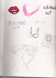
These are the sketches I have so far for my illustrations in Independent Leeds. I've tried to communicate feelings of community, strength and the idea of a 'movement'. As mentioned previously I don't want these images to read as passive aggressive or as if they only apply to those already interested in the discourses. I want these illustrations to speak more about the emotional involvement females have with their zines and those around them. I've chosen to keep the images line based only as I want them to feel almost like drawings within the pages of a diary. 

My plan is to scan in what I have so far and chose the images that work best once cleaned up. David didn't specify sizes so I'm going to put them into a fixed format on photoshop (maybe square or rectangle) so that they'd fit in a neat line/ in place with one another if placed next to each other in the layout. 


Friday 27 January 2017

Low Hummer; Alternatives & Final Design


To complete this brief I went through the La Betes promo shots and discussed with Dan which we felt would be the most appropriate for the cover. We eventually chose this one as it had a central figure and would avoid clumsy and unbalanced collage trying not to crop out other band members for the final cover. Once this was chosen I transferred the image to black and white and printed it out at a square format so I would have something scaled to work with whilst collaging. 

I ripped up a few different coloured and textured paper and played around with loose collage for quite a while. I found myself more drawn to the red and black colour combination; the black ripped edges provided a nice texture while the red acted as an accent colour.

Once I found a composition I was happy with I white tacked the pieces in place and scanned it in; this was so I'd be able to change the collage composition if Dan and the boys didn't like it.

After this I played with the hand rendered text element of the piece. I wasn't sure exactly what they were looking for so I tried out a few combinations, sticking to white and black text to work cohesively with the image.

Once I'd finished these up I sent them off to the boys for discussion and approval. They had a bit of to-and-fro in the band about which they preferred most, but eventually went with the second option (shown again on the last slide of the issue post).

As mentioned on some previous briefs, I'm happy with the image as a piece of design work; whether or not it reflects the bands aesthetic is up to them. I've learnt a lot this year about acting as a professional and meeting halfway with your clients. I would consider myself to have been very lucky this year with the briefs I've been given as I think they've allowed me a lot of creative freedom. However I understand when to take a step back from a piece and understand this is a job and not just a personal project. I'd consider this brief one of those such jobs.
Tuesday 24 January 2017

Le Bete Blooms; EP 'Low Hummer' Brief

Client;

  • La Bete Blooms

Brief;

  • To produce a square format RBG file to be used online as the single artwork for La Bete Blooms upcoming single 'Low Hummer'
  • Take inspiration from J-Cole '4 your eyez only' artwork cover
  • Use one of the photographs provided in La Bete's promo shoot as focus for image

Rationale;

  • Though I feel as though this brief will perhaps be more design focused than illustration, I've agreed to do it for the boys anyway. They want to keep with the photo focus theme (like their EP cover) but with elements of collage this time around. 
  • I sometimes worry the boys are a little too focused on getting excited about what other musicians are doing artistically rather than finding their own tone of voice, but I took the brief on either way as they've become close friends and clients over the past 6 months or so. I think this will be a relatively quick turn around brief that will show my artwork on an international global platform when used in spaces like spotify and soundcloud.

j. cole - 4 your eyez only

Saturday 21 January 2017

Contacting Scream Zines; Research for Independent Leeds


Screenshots from message conversations with Scream Zines founders Ru and Holly

Given that such a big part of this project was centered around the Leeds female zine scene I thought it best to conduct some primary research and interview a couple of participants of the scene. I found Scream Zines via an event I was interested in on facebook. The group had a zine making workshop, as well as a discussion panel about zines and poetry reading at Hyde Park Book Club. 

Contacting them was fairly easy, and I was quite lucky in the fact that they replied to all my questions and queries relatively quickly! I think having this primary research was helpful in developing both the writing and illustrations for this brief.

As my dissertation was based around female zine culture, I felt fairly confident on weighing in on the matter. From an illustrative point of view, I wanted the images to convey a sense of honesty, femininity and community. Speaking with Ru and Holly affirmed my belief in the rise of current feminist and female identity lead zine movements as a result of the current global affairs. I think it's really important that the work for this brief proudly showcases aspects of feminism and coming together without coming off as 'aggressive' as prior second wave feminism may have done. 

This piece needs to feel accessible to those who prior perhaps didn't feel as though feminism or zines were subjects of particular interest. Or perhaps came off as invaluable or disposable. I think the professional context of Independent Leeds will help the article in this respect, whereas if this were to be posted on a blog, the context may not lend itself as to something to be considered as much.

Sunday 15 January 2017

Warren Poster; Final Colours & Delivery of Artwork

Two Finals (left for online, right for print)

Stew got back to me about the colours and said he'd prefer a flat background colour. We chose to go with the yellow after speaking as it was infitting with The Adelphi's branding and was eye-catching too. He liked the texture I'd had on the La Betes poster, so I incorporated that into the design too. This time I put the texture into the white space rather than the black linework as the white space was more dominating, and the texture gave it some depth to look like bland.

Stew wanted this texture on the online version only however. For the printed version he prefered to have a blank background so the paper texture could give it that depth, similar to how I'd produced the posters for La Bete Blooms Adelphi gig poster.

With these two done and sent over to Stew at Warren for approval, the brief was completed with a day to spare (PHEW). It was a really tight deadline, and as mentioned I wish I'd had a bit more time to refine the image slightly. However this has been a learning process in itself. I think I'd also start off with a few more composition sketches before committing to a final image, as I feel the text could have been better placed if I'd taken this into account / sketched out the image originally.

Friday 13 January 2017

Independent Leeds; Brief

The Client;

  • Independent Leeds
  • Approached via instagram
  • Met with David from Independent Leeds to discuss possible projects/ briefs I could do for them. Very open conversation; I was allowed to take the lead on the kind of brief I wanted to do.

The Brief;

  • To both write and illustrate a piece on the female zine culture in Leeds, with specific references to Footprint collective, and the community spirit within the female zine Leeds scene.
  • Create 4-6 images to be arranged by Independent Leeds on a double page spread alongside my article (double page spread).
  • Images must be 300dpi and CMYK format

Rationale;

  • This brief appealed to me for a number of reasons. Being featured within the publication was one of them, as they're distributed around the area for free and in the thousands. I would be fully credited for my work, so having my name promoted to a regional audience in such a way really appealed to me. David was also super great to get along with, we lived a couple of streets away from each other in Hull for a while too which was crazy! Sharing a lot of the same ideas I feel this is a company my work would sit nicely with. Being allowed to write and illustrate this feature was also a huge thing for me. Though I've just finished writing a dissertation (that I didn't particularly enjoy) I do enjoy writing in my own time. It's nice to know as well that the words and images will fit nicely alongside each other and that I have full creative control of the piece. David and John (also run I.L.) have given me pretty free reign creatively, and only ask that the final written piece is between 500-1000 words.

Tuesday 10 January 2017

Warren; Colour Edits & Change of Lineup

Final Linework

I was told by Stew today that the lineup had changed as Canshaker Pi would not longer be able to make it to the gig. This was more than a little bit ill timed giving that the main focus of the image so far had been based on their album cover.

Stew assured me however that he still wanted to go ahead with the design, and that the image didn't look so similar to the album as to be easily recognizable. He also wanted the poster finished within the next day or so so that he could get it out for promotion (AHHHH I HAVE NO TIME) with this in mind I quickly finished up with the text and called it a wrap on the image.

I tried out a few gradient colour ways to send over to Stew, thinking that maybe the slight 'cut out' middle colour portion with the gradient work might make the image stand out a little more. I've sent these over to Stew for consideration. I wish I'd had a lot more time on this brief, but it came up at an awkward point (COP deadline) and then the sudden change in lineup kind of put a spanner in the works too. There are some aspects of this image that I really like (face and torso in particular) but other parts feel a little rushed (those hands...the background) and I wish I'd had more time to tinker with these elements and really get them to a point I was more happy with them.

Saturday 7 January 2017

T-shirt Design; La Bete Brief

Client; 

  • La Bete Blooms

Brief;

  • Create a tshirt design from original gig poster design.
  • Change the text within the speach bubbles to 'la bete blooms' and 'I know it's nothing'
  • Get rid of Adelphi logo

Rationale;

  • A relatively quick turn around brief merely editing some components of previously made work. Excited to see my illustrations as a tangible product!
How it went down
  • I feel as though there isn't really too much to say about this project as it was all relatively straight forward. The new image had to be A3, so I scaled the original image up to that. I then used a fine 'traditional pen' photoshop brush to rub out the unwanted elements of the design (mentioned above) and draw in new elements (eg text or lines of the shirt).
  • The design was going to be used for screenprint so I ensure it was pure black and white before sending it.
  • Sent to Dan, job done!
Final sent to Dan for screenprinting

Wednesday 4 January 2017

Start on Warren brief

Sketches so far

I thought I'd make a start on this brief today while I had a little time going spare. In keeping with the clients desire for the poster image to be based on the Canshaker Pi album cover, I made a start on the main figure. I didn't want to just copy the image for the poster however, so I started playing around with the foliage on the background framing the overall poster.

I really wanted to use this opportunity to try out one of my new pigma thin pens too as I haven't gotten chance recently. I can honestly say that line-work has impacted my work so much this year, and picking up that berol marker in September was one of the best things I've done.

Though my work this year has been varied in the context and format, I feel as though I'm finally starting to develop a consistent tone of voice through the thought-process of line (not sure if that makes sense?) but thinking about creating my images straight from mind to pen to paper gives them an originality and a tone of voice I'm super happy with. There's still a long way to go, but I'm really happy with the progress I've made this year so far.

Anyway, I sent this off to Stew so he could see how it was progressing and he loved it. Thumbs up all round ay.

Canshaker Pi Album Cover

Warren Records; Poster Brief

The Client;

  • Warren Records
  • Contacted via Stewart Baxter @ The Warren
  • W.R. are an independent record label in Hull, stemmed from The Warren Youth Project

The Brief;

  • Create a gig poster for Warren Record's organised gig at Adelphi with the following information;
- Canshaker Pi (band)
- Horse Guards Parade (band)
- Tom Skelly & The Salty Beards (band)
- Location; The Adelphi
-Date; 18th January
-Price; £5
-Doors Open; 8pm

  • Stylistically analogue with DIY feel (similar to La Bete)
  • Focus on Canshaker Pi album artwork as inspo


Rationale;

  • After the success of my La Bete poster, doing another gig poster is something I'm happy to try and take on board. I'm pretty busy at the moment with COP work, but I'm really hoping I can still find the time to fit this brief in, given that it's live paid work for a record label I've known for quite a few years now. It's great to finally by commissioned by Stew and the team to do some work for them!