Monday 23 March 2015

Greetings From; Final images and feedback


Final images

Feedback sheets (positives left, questions//notes for improvement right)

STRENGTHS OF PIECES

Good use of character and shape
Selective colour palette worked well
Skylines to create a sense of depth (both visually and metaphorically)
Use of illustrator itself; retained tone of voice
Interesting concept

TO IMPROVE//WEAKNESSES

Confusion over what the concept was (could have been clearer)
Print quality (both size and physical print)
Consistency of colour? Suggested I use a consistent palette throughout; though this would have made it more difficult to differentiate each city and gang

PERSONAL REFLECTION

Although many people picked out colour as a strength to my work, I still feel as though the London image could have been pushed further in this aspect, I wish I had used more contrast between the figure and the background as they are both still grey and of a similar hue.

I also feel within the London image the colours aren't as evenly spread as they are on some of the other postcards, and this weakens it as a stand alone illustration. 

Print quality was also an issue but due to commitments to screen printing workshops and given the time of year I was not able to book a print slot before the final crit, this could have been avoided with forward planning as I under estimated how busy the print dungeon would be this time of the year (I attempted to book a print slot on Monday morning for the Friday but it was fully booked)


FINAL IMAGES WILL BE PRINTED OUT ON GOOD STOCK FOR FINAL HAND IN

Final printed postcards on good stock matt card


Greetings From; Week 3


Further development of London postcard

Continuing from the previous week I went back to revisit the London based postcard. I wasn't happy with the way the colours worked together. I tried brightening them and altering the hues slightly; this higher contrast in colours did work a lot better than the previous attempt, however the postcard still lacked the same bold impact my NYC one had. 

Rather than having a complementary palette through the image, I tried having one strong accent colour instead. The image immediately seemed to have more impact. 

I would have liked to play around even further with colour but didn't want to get too caught up in constantly changing things. Adobe makes it very easy to change colours and compositions ect but given how fast paced this brief was I didn't want to get sucked into trying every shade of grey or orange, switching backwards and forwards, as sometimes the choice in illustrator and photoshop can be a little overwhelming.


Scamps of Christopher 'Dudus' Coke//layout

With both of my final two postcards I found, through research, I was focusing in on one individual that was particularly well known within the gang; almost a celebrity face.

Whilst with my previous two postcards I had wanted them to convey a particular 'thuggish' attitude, I felt that Coke's story (Kingston, Jamaica) called for a different way of developing my final image; I wanted it to convey something different.

Despite Coke being head of a very criminally active gang, what touched me about his story was that he tried doing what was best for his community and the people around him. Kingston is somewhere rife with not only crime but police brutality and an overall lacking of true justice and safety. While the activities of Coke's gang were far from lawful, he did try and maintain a safe environment for the people of Kingston; no one was to be attacked, robbed or raped, and though his punishments were often violent, for a town that had previously had no real law enforcement it was a step up from what they had. He also provided funding to children so they could go to school and better themselves. His story seemed different to the previous gangs I had researched and I wanted to convey that within my image making


Development of postcard (Kingston; Jamaica)

Reference photos of Kingstown Jamaica compared with popular touristy Jamaica

Despite the gang being based in Kingston I also chose to incorporate some imagery from other parts of Jamaica. I wanted to show the contrast in where Coke had been brought up and was trying to better compared with the parts of the country that had money pumped into them for the tourist trade.

I wanted to show this difference between those who had and those who hadn't. Those with and those without. The tall barbed wire gates of Kingston also worked as a duel signifier for the prison Coke is currently being kept in to serve his sentence for his crimes.


Development

I didn't want Coke's expression to be one of anger or hate. I wanted him to appear a little defeated and sad. Kingston was his home and he tried to better it for his people, but the only income came in the form of drug trafficking and illegal activities; he was fighting a war he could never win

Scamps for Mexico postcard

My final postcard featured a woman very different to Coke. Felix who is now thought to be running the Los Antrax gang (Mexico) is known as the 'Kim Kardashian' of organised crime. Before her supposed 'rise to the top' she was a social media fanatic, who would often post photographs of herself and her family with lavish items. Owner of a personalised pink AK-47, her social media outlet all but disappeared once her spouse (the then leader of Los Antrax) was imprisoned, and rumours of her running the gang came to light.

I wanted to play on this 'sexy celebrity' status Felix had acquired, and throw it together with her now 'ganglord' status. Whereas for my first two postcards I'd used high end fashion as a reference point, for this postcard I looked at glamour models. Their often more revealing and commercial poses worked hand in glove with the kind of persona Felix often liked to portray.

As I developed this postcard I also found that I really liked the simplicity of just using the block shapes, I didn't want to overcomplicate this image so kept the details fairly minimal. My concern however is that it will be difficult for viewers to work out which city (or even country) this is meant to represent.


Process of final postcard (Mexico)


Greetings From; Crit & Week 2

Notes from crit

TO PURSUE//THINK ABOUT

More research into gangs; look at Kingston in Jamaica, need range of gangs
Look at details of each gang, what are their colours//symbols//marks ect
More experimentation and play; expand on concepts even more
Look at above mentioned artists; Hellen Jo for subject matter//Ben Kirchner for media (vectors)

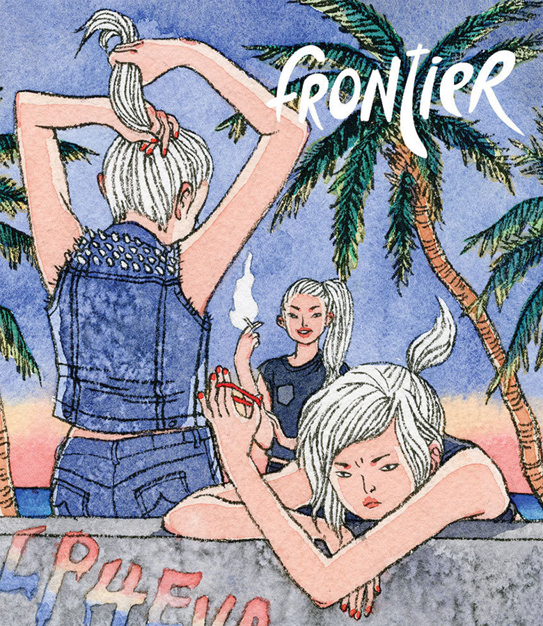
Helen Jo (work on girl gangs)

POINTS OF INTEREST//TO CONSIDER IN OWN WORK

Very character driven with quite simplistic backgrounds, enough to give an idea of space and location without drawing away from the figures
Selective colour palette 
Close proximity of girls to show their strong bond with one another, very much a unit as much as individuals
Facial expressions key as well as gesture and pose to convey 'attitude' 
Small symbolic devices used to express their 'hardcore' demineener; smoking, metal studs on clothing, blood on walls and faces (violence), graffiti on wall (vandalism) whilst small details such as red nailvarnish and lipstick still indicate these women still maintain their feminine side (girls can still be badass without having to look like overly masculine)

 
Ben Kirchner

POINTS OF INTEREST//TO CONSIDER IN OWN WORK

Make sure work is very shape driven
Importance of colour in vectors (selective is best? Vectors allow for bold colour so use it!)
Consider composition of images; focal points
Simplify information; what needs to be in the illustration to make it work, don't over complicate it, where does the detail need to be and where can be described with pure block shape?
Consider style; don't want my illustrations to look like traced photographs, how to tackle illustrator while still maintaining a tone of voice

Quick roughs in response to research

I began more research into gangs and what made them specifically stand out from one another; their colours, tattoos, the type of crime they were involved in, where they originated from. From this research I began scamping out possible ideas


Practice using Adobe Illustrator

I quickly scanned in one of these scamps and began to trace it on illustrator as a practice at using the software. Adobe illustrator is something I've never used before so getting to grips with all the different commands and tools was a bit of a struggle. I found however that the more I used the program the easier it became to use, I found the simple 'learn by doing' process helped me most.

Once I'd finished this simple test I exported it to put onto my blog; here I found the difference in quality exporting the image as a JPEG (bottom left) and a PNG (bottom right) something to take note of for future exportations. 

Roughs//research for NYC postcard

I undertook more specific research into gangs of particular cities at this point. I wanted my postcards to be character driven, and I wanted them to really convey 'attitude'. Gesture played a bit part in this and while scamping I found that looking at high end fashion photography really helped; the models often have to convey attitude through posture and expression alone, much like my characters would, looking at these photographs informed my thinking process a lot


Process of NYC Blood gang postcard

Once scanned in I worked over the original piece in layers, slowly building up more detail.
I found it very beneficial and important to LABEL LAYERS and folders in illustrator in order to more efficiently find what I was looking for in each image. I tried to include small details in order to make the city recognisable as well as the gang. I chose the red, blue, white colour scheme as it matches the american flag, I also traced a NYC landscape to place in the background and gave her a statue of liberty tattoo, alongside the red star, three cigarette burns and 'blood' tattoo that are all symbols of the Blood gang.

Roughs for London postcard

I repeated this process for my next gang (London based). However through development I'm still not completely happy with the colour scheme. The gang themselves are known for wearing black, however the greyscale palette seems too dull. But the later developed brown hue colour palette seems too faded. Something to address in continued development.


Development of London postcard; unfinished