


Final images

Feedback sheets (positives left, questions//notes for improvement right)
STRENGTHS OF PIECES
Good use of character and shape
Selective colour palette worked well
Skylines to create a sense of depth (both visually and metaphorically)
Use of illustrator itself; retained tone of voice
Interesting concept
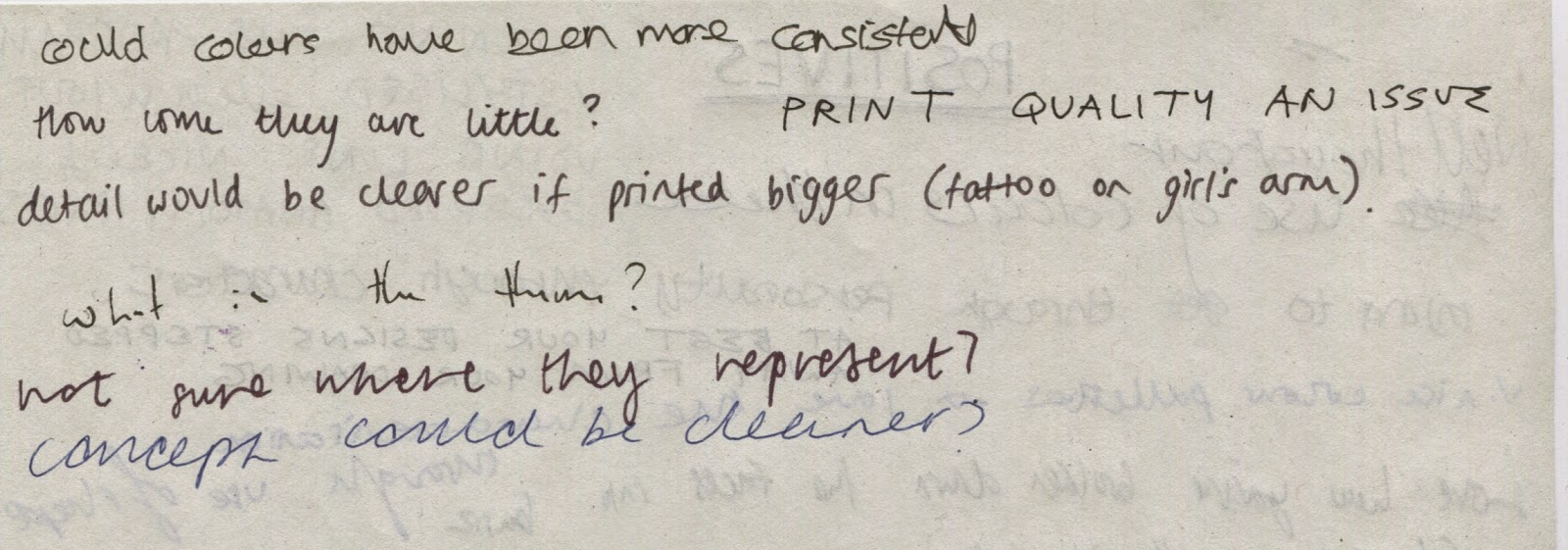
TO IMPROVE//WEAKNESSES
Confusion over what the concept was (could have been clearer)
Print quality (both size and physical print)
Consistency of colour? Suggested I use a consistent palette throughout; though this would have made it more difficult to differentiate each city and gang
PERSONAL REFLECTION
Although many people picked out colour as a strength to my work, I still feel as though the London image could have been pushed further in this aspect, I wish I had used more contrast between the figure and the background as they are both still grey and of a similar hue.
I also feel within the London image the colours aren't as evenly spread as they are on some of the other postcards, and this weakens it as a stand alone illustration.
Print quality was also an issue but due to commitments to screen printing workshops and given the time of year I was not able to book a print slot before the final crit, this could have been avoided with forward planning as I under estimated how busy the print dungeon would be this time of the year (I attempted to book a print slot on Monday morning for the Friday but it was fully booked)
FINAL IMAGES WILL BE PRINTED OUT ON GOOD STOCK FOR FINAL HAND IN
.jpg)

Final printed postcards on good stock matt card
No comments:
Post a Comment