Notes from crit
TO PURSUE//THINK ABOUT
More research into gangs; look at Kingston in Jamaica, need range of gangs
Look at details of each gang, what are their colours//symbols//marks ect
More experimentation and play; expand on concepts even more
Look at above mentioned artists; Hellen Jo for subject matter//Ben Kirchner for media (vectors)
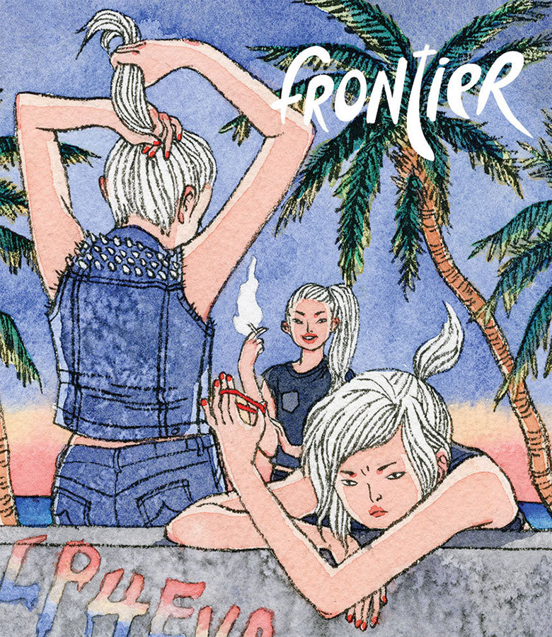
Helen Jo (work on girl gangs)
POINTS OF INTEREST//TO CONSIDER IN OWN WORK
Very character driven with quite simplistic backgrounds, enough to give an idea of space and location without drawing away from the figures
Selective colour palette
Close proximity of girls to show their strong bond with one another, very much a unit as much as individuals
Facial expressions key as well as gesture and pose to convey 'attitude'
Small symbolic devices used to express their 'hardcore' demineener; smoking, metal studs on clothing, blood on walls and faces (violence), graffiti on wall (vandalism) whilst small details such as red nailvarnish and lipstick still indicate these women still maintain their feminine side (girls can still be badass without having to look like overly masculine)
Ben Kirchner
POINTS OF INTEREST//TO CONSIDER IN OWN WORK
Make sure work is very shape driven
Importance of colour in vectors (selective is best? Vectors allow for bold colour so use it!)
Consider composition of images; focal points
Simplify information; what needs to be in the illustration to make it work, don't over complicate it, where does the detail need to be and where can be described with pure block shape?
Consider style; don't want my illustrations to look like traced photographs, how to tackle illustrator while still maintaining a tone of voice
Quick roughs in response to research
I began more research into gangs and what made them specifically stand out from one another; their colours, tattoos, the type of crime they were involved in, where they originated from. From this research I began scamping out possible ideas
Practice using Adobe Illustrator
I quickly scanned in one of these scamps and began to trace it on illustrator as a practice at using the software. Adobe illustrator is something I've never used before so getting to grips with all the different commands and tools was a bit of a struggle. I found however that the more I used the program the easier it became to use, I found the simple 'learn by doing' process helped me most.
Once I'd finished this simple test I exported it to put onto my blog; here I found the difference in quality exporting the image as a JPEG (bottom left) and a PNG (bottom right) something to take note of for future exportations.
Roughs//research for NYC postcard
I undertook more specific research into gangs of particular cities at this point. I wanted my postcards to be character driven, and I wanted them to really convey 'attitude'. Gesture played a bit part in this and while scamping I found that looking at high end fashion photography really helped; the models often have to convey attitude through posture and expression alone, much like my characters would, looking at these photographs informed my thinking process a lot
Process of NYC Blood gang postcard
Once scanned in I worked over the original piece in layers, slowly building up more detail.
I found it very beneficial and important to LABEL LAYERS and folders in illustrator in order to more efficiently find what I was looking for in each image. I tried to include small details in order to make the city recognisable as well as the gang. I chose the red, blue, white colour scheme as it matches the american flag, I also traced a NYC landscape to place in the background and gave her a statue of liberty tattoo, alongside the red star, three cigarette burns and 'blood' tattoo that are all symbols of the Blood gang.
Roughs for London postcard
I repeated this process for my next gang (London based). However through development I'm still not completely happy with the colour scheme. The gang themselves are known for wearing black, however the greyscale palette seems too dull. But the later developed brown hue colour palette seems too faded. Something to address in continued development.
Development of London postcard; unfinished


No comments:
Post a Comment