
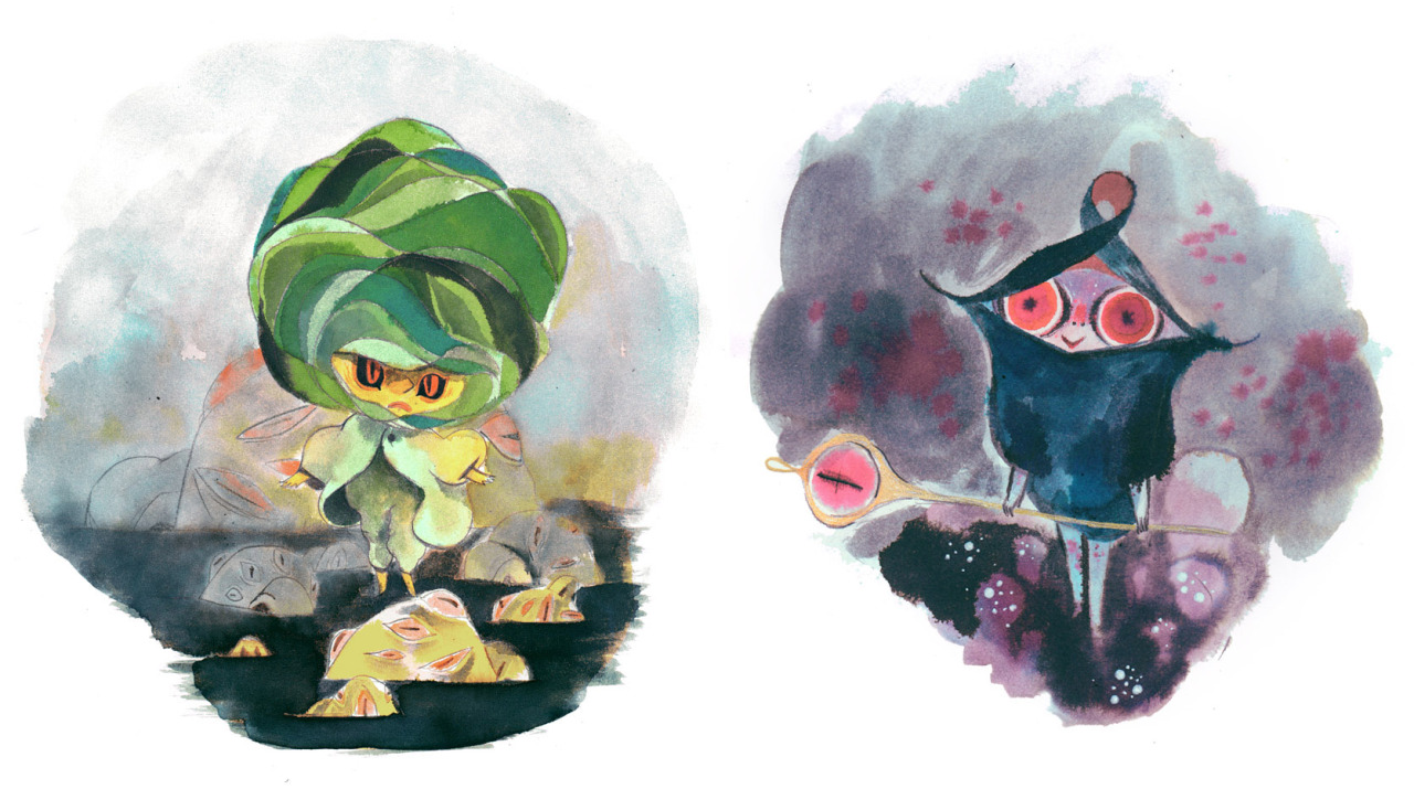
I found Flechais a while ago on pinterest, and decided to revisit her for this project given how stumped I was currently feeling in regards to media. What I utterly adore about her work is the strong and confident use of character and media application, resulting in unique and well crafted pieces of illustration.
Her often surreal subject matter also fit in well with the sorts of source material I was working with in terms of Milligan's bizarrely fun poems; seeing how she applied media and used colour to evoke a sense of atmosphere.
.jpg)


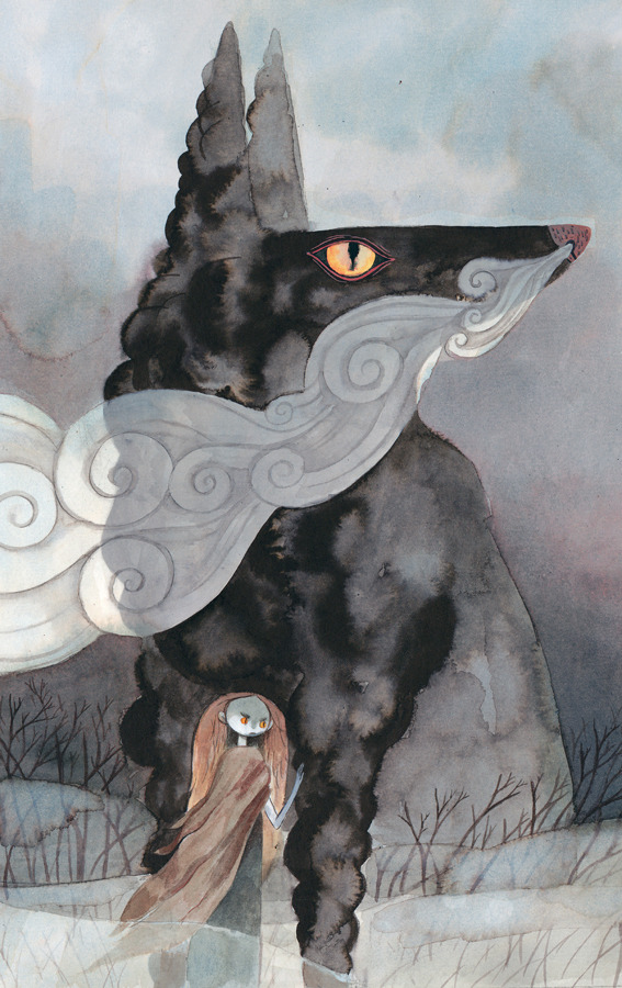
'Granny' poem with watercolour experiments
From this I started my own watercolour experiments and felt that they worked a lot better at conveying the tone of voice Milligan used in his poems, but through illustration. They were still whimsical and quirky but with a bit more of a sophisticated and considered attitude.
Though I was more pleased with my image making I still felt as though I lacked direction for my A2 final poster. At this point I turned to the book 'The Essential Spike Milligan', an anthology of Milligan's work spanning throughout his life in a almost autobiographical sense. I thought it might make sense to document different poems from different parts of his life in order to select which ones I wanted to use for the postcards; and this might help to inform what I wanted to be included on the poster.
.jpg)

Break down of Spike's poems via his life events//illustrating of 'The Land of the Bumbley Boo'
Once I'd separated the poems into the different chapter titles of the book (each chapter documenting a different period of his life) I started to illustrate the Bumbley Boo, however I felt like I was just going in circles. I was just illustrating another one of his poems and I wasn't really getting any closer to what I wanted to portray and say about Spike Milligan; what did I want his legacy to be? What did I want the illustrations I was making to convey?
.jpg)
.jpg)


A3 portraits of Spike in mixed media
I tried doing two larger scale illustrations of Milligan, I thought by upping the scale of my image making something new might come from it. This was also another opportunity for media play and I found that I quite liked the mixture of graphite pencil with the watercolour. It allowed for more detail and contrast within the image; it was sort of bringing together that notion of the colourful side of Milligan mixed with the darker, shadowy side.

Spike Milligan: Love, Light and Peace (documentary)
Growing up I'd seen a few documentaries on Spike Milligan, and I felt as though I needed more input into my work for it to be truly successful; I needed a way to draw together everything I knew about Spike Milligan and conclude it via an A2 poster and accompanying work.
I watched the very recent BBC documentary 'Spike Milligan: Love, Light and Peace', that I hadn't previously seen. And it was EVERYTHING I needed. Largely made up of interviews with Spike talking about his own life and work, with interviews from family, friends and those he inspired, this documentary said everything I needed to know and everything I wanted to say. It summed him up so well because it was told from HIS point of view, from the point of view of those who KNEW him.
It got to the very core of what I wanted my poster to be; what I wanted my work to convey. Here was a man who struggled, who battled and was flawed and so far from perfect, but was kind and loving and magical. A man who loved his children beyond words, who campaigned for mental health to be talked about, who fought for environmental issues. Milligan was at times in his life utterly depressed, but he was also utterly in love with the world. And so I while I wanted to show some of the darker sides to Milligan, I wanted these illustrations to largely be a celebration and something positive, as I think that's what he would have wanted to be remembered by.
.jpg)
.jpg)
Compositional scamps
It was also after watching this documentary that I finally found a composition that worked for my poster! It came in the form of a little scamp but it solved my issue of wanting to include lots of aspects of him in one image without it being too overwhelming or confusing.
The documentary also made it a lot easier to organise what I wanted to include in the poster, and what I wanted to leave out.


Winnie-The-Pooh - The complete collection of stories and poems//Illustrations by E.H. Shepard
Stylistically I knew I wanted to work with watercolour, but the tone of voice was still a bit of a blank spot for me. Given that I was at home in Hull during this time I turned to my own art books for inspiration. It was here that I picked out my Winnie-The-Pooh complete collection of stories and poems, I felt that the illustrations in this book reflected a similar sort of 'homely' and nostalgic quality I wanted my own to evoke. From here I began scamping out the separate components that would make up my poster.
.jpg)


Watercolour scamps of smaller components of poster
Once the poster was out of the way I set about picking three poems that I felt reflected different times in Milligan's life. I decided on The Land of the Bumbley Boo, Unto Us and Goodbye S.S. I wanted to keep the postcards quite simple with a mixture of text and type, I felt that a 'quiet' sort of illustration would be appropriate here as I wanted the poems to reflect a more quiet side to Milligan; a more thoughtful and withdrawn side, without being overly sad or tragic.
.jpg)
Colour tests//choosing of poems for postcards
For the stamps I decided to focus on Milligan's various occupations and roles, I then picked four I felt could be best represented through a couple of simple symbols given the stamps small size, and scamped out some roughs to choose my final four.
.jpg)
Colour scamps for stamps
.jpg)
Personal reflection//feedback
OWN CONCERNS
Will my opinion of Milligan be conveyed the way I want it to be? Is it too overly complex?
Time constraints of doing an A2 watercolour poster?
Too much negative space on postcards when compared with stamps and poster?
STRENGTHS (PEER FEEDBACK)
Good knowledge of Milligan
Have something want to say
Conveyed well
Lots of research
ACTIONS TO TAKE//IMPROVEMENTS (PEER FEEDBACK)
Rather than have the postcards with a white background and too much negative space, have them with a coloured background and objects in black and white to match the poster - start scamping this out to choose colours//see how it'll work
Work on A3 for final poster then blow it up to A2 to be time effective
No comments:
Post a Comment