Wednesday, 30 December 2015

Sting; Colour Animation Tests


TEST 1

To get a better idea of what my final sting may look like I decided to quickly draw up a digital version of the sting in full colour to make sure  the pacing // size ect all worked together. In this first attempt the pacing at the start of the film was far too fast compared with the slow movements of the rest of the animation, however it was nice to get a better idea of what the final sting was moving towards!

Colour Test 2 from Jazz Harbord on Vimeo.

TEST 2

With this testing I fixed the initial pacing problem at the start of the video! However some of the elements still needed editing in size so that they wouldn't cut off an seem too small // not fill the frame while they were being animated


Colour Test 3 from Jazz Harbord on Vimeo.

TEST 3

This final version saw amendments mainly to the original photoshop document and size of the layers within it. I copied and reflected the tree layer to make it longer to allow for the transactions it goes though to take place without it being cut off. At this point I'm happy with where my animation is in terms of scaling, movement and timing!

MUSIC

Still the music search continues through the black hole of royalty free music. Though I'm tempted to use a track from my earlier discovered Murakami playlist, I would like to use something royalty free so my finished sting feels like it could stand on it's own two feet!

Saturday, 26 December 2015

Adaption of Final Compositions to Square Format


Final print designs

DIMENSIONS AND FINAL COMPOSITIONS

In preparation for the Christmas break I redesigned my three compositions to fit the 30cm x 30cm lino format so they could be heat pressed ready for cutting over the Christmas break. When choosing between lino and screen print, another consideration I had was about the dimensions of the work. If I had chosen to do screen print, the images would have been A3 portrait to resemble a 60s gig // music poster, drawing on Murakami's work, his musical inspiration and his counter culture rebellious views. If I chose lino as my primary print process however, as I have, I decided the format would be square to resemble a 12 inch record sleeve, again drawing upon Murakami, music and culture; but in a slightly different way. 

2 COLOUR PRINT

When deciding how to incorporate two colours into my print it did occur to me that I had a few options. I could use a gradient type of effect as previously tested, but I was unsure of how this would be read and may give the prints a bit of a 'tacky' or 'blurry' feel rather than a crisp finalised product. I also thought about perhaps monoprinting the original stock a burnt orange and then printing the lino on top using a dark blue ink but after a discussion with my peers we decided that could retract from the detail of the print itself; making it appear messy or cluttered. I decided in the end to simply print the figure and linework in dark blue and the text a dark orange using a stamping method as I feel this will reap more successful prints. Because of this the text and image will have to be cut on separate linos, meaning there are five linos in total for me to cut out.

Thursday, 24 December 2015

Organisation Planner


Throughout the past few weeks of this course I've been keeping a weekly planner to help organise my time effectively and ensure I'm getting things done as I go along. The planners have been a little intense but also needed as I feel this module I'm failing a little at time management which is getting me down a little bit!

Organising the weeks and breaking the tasks down helps make the project more manageable with our other modules as well, and is something I should try and do more

Little and often is key! 

Wednesday, 23 December 2015

Animation Tests (Roughs)

Test 1; Forgotten Composition Settings from Jazz Harbord on Vimeo.

STARTING THE STING

Though I want to make my sting using the print side of this brief, I also really wanted to get a start on animating and getting to grips with the software. My idea is this; if I get the pace and movement of the animation finished, when I'm done printing it'll simply be a case of replacing the elements and copying the animated movements. This allows me to get a head start on the sting without having to wait until my printing is all done first.

TEST 1

This first test reminded me of something very simple but vital, and that is once the images are imported to make sure the size of your composition is the same as what you wanted it to be at the start! Because I didn't do this the above video was the result; not very good!


TEST 2

With the size of the composition altered I tried out the animation again; there are still tweaks to be made in relation to timing issues and things not moving when I want them too. The size of certain files also needs altering as things like the clouds // trees // mountains ect cut off where more is needed to complete the animated movement


Tester 2; Edit from Jazz Harbord on Vimeo.

TEST 3

I made some alternations in timing and pace, however the sizes of the files still need figuring out so they don't cut off mid-movement. Additions of colour, texture and more accurate sizes, shapes and details need adding before I can get a real feel for this sting coming together

MUSIC

Music wise I've been searching the net for some royalty free psych music to go with my sting, so far the search has been a little underwhelming. While there are some tracks out there, very few feel as though they fit the feel I want my sting to have. I wanted something that felt authentically 60s and psychedelic whereas a lot of the music on these sites feel a little cheesy and lacking in conviction; is this too much to ask for a piece of royalty free music? Should I be looking at other genres? The search continues.   

Sunday, 20 December 2015

Crit & Tutorial


During this crit I explained how my screen printing day hadn't exactly gone to plan. When showing this print next to my lino trial I felt I knew that lino was the print opinion I felt most confident perusing. However some people were still encouraging to keep trying at the screen print as the details and halftones could be effective if they came out properly. I was given some tips on where to source high end lino cutters and inks if I chose to follow that route though which was very helpful!


I went to my tutorial feeling a little lost and bummed out about my prints and where to take them, a small part of me wanted to keep at the screen prints until they worked, but a larger part of me wanted to lie on the floor sobbing at the thought of re-entering the screen printing zone of the print room. 

My talk and tutorial with Teresa helped a lot. I think I was putting too much pressure on myself and working myself up a lot about the screen prints, feeling like I had to push myself with something I wasn't comfortable with, rather than trying to hone my lino skills and elevate them to a higher level. 

During the tutorial I decided that lino printing was the way to go; it wasn't an 'easy way out' as I may have been thinking about it, and I would very much still be able to push my prints a lot further than where they were now. It made sense as it was not only a method I felt a lot more confident with, but it also made more sense in a time effective manner. I could have spent another three weeks battling with screen printing (and being unable to access the studio as much over the Christmas break) onnly to have a number of unfinished and unfinalised prints at the end. At least with lino I could begin locking down the designs now, have them cut over Christmas and be ready to print by January.


Saturday, 19 December 2015

Large Scale Screen Prints (The Worst Day)


SCREEN-PRINTING

Process & technical issues; To start off the day someone took my unused print medium from the room and given the opening and closing times of the print shop I was unable to buy anymore, the print staff were very helpful and found some other colours people had left behind for me to use instead, however from the offset this meant my screen prints weren't going to be the burnt orange // dark blue colour combination I'd wanted to try out.

The day followed in a similar vain. The inks and mediums came out unevenly, they started drying up, the layers wouldn't overlay correctly; the word unsuccessful wouldn't cover how I felt about this day. I left the print room a broken shell of a woman.

However unsuccessful this day was, I did LEARN a lot from it though, and that's something to be noted!

Things learnt; Keep your medium in the illustration room safe in your draw away from thieving hands! Make sure your image is correctly exposed using a true black ink // photocopier; I feel like maybe my prints didn't come out well in certain areas because the image itself could have been better transferred onto the screen. Ensure the mixture of acrylic paint to medium is correct; the reason for it drying out so fast may have been the quantities of each substance, as well as waiting for my partner to line up his images (another thing to note - get your own screen rather than sharing, this may have helped with alignment). Use masking tape to mark out corners to place the paper to get a good alignment and finally use a larger size paper to the image you're printing! It may have been easier to line up if I'd been printing on A2 paper rather than A3, it would have also left room for cropping later on.

Things to consider moving on; After this experience I definitely felt myself leaning a lot more towards lino as my print medium of choice, however I wanted to check with my peers to get their opinion. Part of me wants to keep trying at this until I get it right as screen print is something I'd love to have confidence in doing!

Friday, 18 December 2015

Illustration Fridays; Batch 1

Brief

Who: Illustration Friday Website
What: Digital file to be submitted to website
When: One every week
Context: Shown on homepage of website
Media: Any // open

Time Scale // Intentions 

Given the short timescale for each of these Illustration Friday briefs I wanted to focus on making pieces quite immediately; spending only a couple of hours on each image every week. But I also wanted to have fun with this brief, given that the requirements each week were very open I wanted to create images that I enjoyed making but also that benefited the evolution of my visual language.

Self Initiated Limitations 

I decided to give myself some limitations to work with in order to try a few new things out and test my visual abilities. Each piece was to work with a limited colour scheme, be digitally rendered and created with the brush tool shape dynamics turned off. I've wanted to play around with lifework in digital imagery for a while and these fiefs offered an opportunity to do this.

I've also wanted to work with the integration of imagery and text in a similar way to my summer work and "Dear Self' zine for a quite a while. The idea of creating imagery alongside personal // instinctive thoughts is something I've received a lot of positive feedback on in the past and the opportunity to play around more with that in this brief was exciting!

Honing in and practicing my anatomical drawing was something else I was able to explore with these quick briefs. I made sure to explore a wide range of reference imagery before creating each image. The juxtaposition of the kind of visual language this resulted in alongside the bold linework and bright colours was something I found myself becoming quite fond of as each week progressed. 

Thursday, 10 December 2015

Drawings for Screen Prints // Final Compositions


Continuing in my visual journal I started making some potential final designs for both some large scale A3 screen prints and my final prints as a whole. I drew up some finalised compositions and began working larger scale with my drawings for more finished prints.

I have found however that my larger scale A3 drawings seem to lack the immediacy and proportion when compared with my sketchbook images. The eyes in particular seem to be a lot less fitting and over done - not portraying the emotions or feelings I want them to portray. Perhaps it would be worth taking my sketchbook drawings and fitting them with elements of my more detailed drawings to come up with a final resolution.

I've also settled on a colour palette for my final prints, going with the burnt orange // dark blue. I know I've yet to test these colours together in print but I really believe they work on both a conceptual and a visual level; communicating the atmosphere I want to emulate succinctly 

Wednesday, 9 December 2015

Crit, Feedback & Sting development


FEEDBACK

Positives // Strengths; People tended to respond well to the work produced so far! I'm really happy that the concept of the work has people excited as I was a little unsure as to whether people would think that it worked or not. While I've yet to try out a larger scale screen print people seemed to like both the large scale lino and the small scale screen print. This has made it a little difficult to chose which method to go with though.

What to work on // Considerations; Colour and print process seemed to split people, while some preferred the green // purple combination others liked the pink colours of the lino and while I'm still not settled on a palette it's something to bear in mind, similarly with the process. Some enjoyed the energy of the lino while others preferred the textures and bitmap of the screen print. I'm hoping my larger scale screen print will help me choose a print method.

STING WORK

Quick sketch done after crit

String concerns; Once we'd split into smaller groups I had a chat about my sting, while I felt confident in what I had to do for the print side of my brief I'd neglected the string side somewhat, I felt like I had to make a start soon as I didn't want to leave it as a last minute rush. However I had no idea what I wanted to do or how to make it fit with my prints.

It was suggested by the group that I keep it simple, and use one of my prints for the sting, using scale and a sense of depth to create movement. It was a simple idea that hadn't crossed my mind before! After the crit I planned out a brief storyboard to help me get started with the animation.

Storyboards


Tuesday, 8 December 2015

Project Proposal

Project Proposals 

Lino Development


LINO DEVELOPMENT 

Process; Given the work I'd been producing I felt I best try out some larger scale prints to see whether I wanted to print my finals with lino or screen print. I scanned in one of my sketches and rearranged it on photoshop to fit a square format (for larger scale) and then traced that onto some polymer lino (for quicker cutting than hessian) and printed it. 

Technical issues; My first print came out a little warped, this was due to me using the roll press rather than the flat press, something I noticed straight away and quickly rectified! After this all the prints came out rather well, I found that by checking the prints every time I could see if there were areas I needed to roll more ink onto or if there were any parts I was missing, for the most part though they came out pretty well! The only other thing I found was that towards the end some of the prints were becoming a little blurry, but this was probably down to mixing coloured inks onto the lino without washing in between. 

Things to consider // learnt; I hadn't thought about using a gradient or mixture of two colours before this print experiment; it would be a way of fulfilling the brief criteria without needing stamps or a lino reduction. If I were to use lino for my finals I would have to invest in some higher end lino cutters and hessian backed lino to get the amount of detail and finish I'd want from them, rather than using cheaper cutters and polymer lino. 

Monday, 7 December 2015

Further Sketchbook Work


VISUAL JOURNAL

Continued to explore subject matter, focusing primarily on books rather that Murakami's life (less complicated, creates better work flow)

Decided to have motifs from his most known works carry through all prints to create a sense of connection to his work while putting my own 60s twist on it to draw out the rebellious rejection of traditional Japanese culture 

Began scanning some images in and playing around with colour; using contextual references to really add more depth and greater understanding and purpose

 
OZ Magazine

Contextual relevance to own work; This magazine really took on the idea of freedom and 60s counter-culture vibes. Their bold imagery and colour palettes make them striking to look at. While working in my visual journal I kept referring back to these pieces for their image making qualities; colour and pattern in particular. The halftones would be easily replicated if I were to go with a screen-print method of printing, and the idea of using lots of gradients and overlays could be very effective, it's just whether I have the time and printing ability to make them as high finish as I would like them to be!

Martin Sharp

Contextual relevance to own work; Again the selective colour palettes in these works really make them stand out and show what you can do with only a few different hues. Looking at both Martin Sharp and OZ Magazine has got me thinking a lot about colours. While experimenting in my visual journal I came across the burnt orange // dark blue palette and, though I'm still open to change, what I liked about these colours was how I felt I had drawn equally from the bold colour juxtapositions of OZ and Sharp but toned them down slightly to encapsulate Murakami's darker and more sober tones - something to keep in mind for further print experiments.

1960s Manga

Contextual relevance to own work; While stylistically and palette wise these images don't seem that relevant to the work I'm undertaking, I'm really glad I took the time to look at them after my crit! There's something about the first and last images above that really plays on the notion of women being innocent and feminine and beautiful while the middle image displays the woman as disinterested or perhaps preoccupied with other thoughts. It's this kind of mixture that Murakami has at times played with in his works. The complexity of women; the contrast in the way they are preconceived to be and the way they actually are. Do I want the women in my prints to all be the same? Do I want them all to be sad an innocent or do I want a mixture to show them to be strong and full of depth? Things to think about!


Print Inspiration (Presentation)

Natalya Balnova; Screen Prints

Starting to think about my final prints I began looking for inspiration in terms of printing and presentation. While I'm still at the experimenting stage of this project I want my final prints to have pride taken in them and feel finished and highly crafted. Although I'm still unsure which print method I'm going to use, I thought I'd take a look at Natalya Balnova's website for some nice printspiration!

Things to consider // picked up from looking at Balnova's work; leaving space around your prints so they don't feel overly cropped // have room to breathe. Consider quality and pigmentation of inks being used to get a strong and consistent spread throughout whole piece. What stock should it be printed on to best showcase colours // quality of work. No grubby fingermarks!! Nice and Clean!! 

Sunday, 6 December 2015

Workshop; Screen-print


Initial thoughts; Screen print is a process I'm very up and down with. When the pictures aligned and the ink printed well I enjoyed the results! Though this print was made only using a sketch and is a little rough and ready I liked that about it, the use of halftones and block colour was something I also hadn't tried before and enjoyed the results of. The struggles of this medium however come in the form of offset prints and under // over inking. A lot of the prints that came out had an uneven amount of ink distribution resulting in darker // lighter colours, blurring where the ink was too thick and fading // blotching where the ink was too thin. Lining the two prints up was also difficult and more often than not I ended up with an offset print. 

Possibilities of process; Screen printing is something I would really like to be able to do well! This first session has taught me a lot in terms of technique and outcomes, and while the process itself is something I struggle with, it does allow for high levels of detail, overlaying of colours and that sort of old school 'gig posters' feel that would fit the themes of my work well. More practice might be needed and further experimenting to decide if it's the print process I should use!

Workshop; Monoprint


Initial thoughts; I enjoyed the process of mono-printing today and liked how some of the figure drawings came out (in particular the ball point pen drawing with teal coloured ink).

Possible use of process; This said however I don't think mono-print is right for the kind of prints I'd like to produce as an outcome. Though very textured they are also a little unpredictable and lack the consistency I'd want from my prints given the level of detail I want my finals to incorporate. The plain textured prints however may come in useful if I wanted any shape driven work for my sting. The print textures could be easily cut out into objects or scenery if I need them!

Saturday, 5 December 2015

Workshop; Lino


Initial thoughts; Lino is a print technique I haven't used in over a year, however I found myself really enjoying the process during this workshop. Though these linos were created in only a few hours on polymer lino (very easily cut) with little detailed drawing beforehand I'm still happy with how they came out! I did a little experimenting with colour and stock during this workshop too to get an idea of how inks and colours may work together for further developed prints.

Possible use of process; I feel that lino printing is a technique I feel relativity confident with, both in terms of cutting and printing, as well as one that I enjoy! I just wonder whether I would be able to get as much detail onto the pieces as I'd like. As well as this, there is also the issue of the print having to be two colours plus stock, meaning I would either have to master reductive lino printing or use lino cut stamps as a means to get another colour on there.

Crit Feedback

Crit & Feedback Sheet

Strengths of work so far; good exploration of medias // ranges of ways of working to allow concept of body of work to evolve (different to mundane // cliche ideas of Murakami's work; pushed past 'just sad women'). Stylistically work is starting to reflect 60s time era. Photocopying work larger scale // onto different coloured papers has allowed for new perspectives on work // seeing which ones work large scale // changing palettes

Suggestions to further work; more anarchy in work! Really get that 60s rebellion in there! (parhaps consider palette // patterns?) Strip down ideas for posters; really think about what you want you want to focus on and what to leave out. Maybe just focus on his work rather than over complicating it with his life as well? Consider colour scheme to allow them to work as a set

Contextual research; check out Oz Magazine, 60s//70s Japanese manga and Martin Sharp for more buzz and psych anarchy 

Friday, 4 December 2015

Sketchbook Development


With a fresh take on Murakami and a renewed sense of creative buzz I decided I needed to start locking down my ideas for final print proposals. To kick this process off I made another mind map using motifs of Murakami's work to break things down into possible avenues to represent through my final prints. 

The only problem with this process was I began over-complicating what I wanted the prints to represent and how they'd work as a collective. Realistically I think I was trying to communicate too much and therefore loosing the authenticity of the original pieces. Rather than get too caught up in the ideas however I decided to push on visually with a rough // interchangeable theme for each print. I felt it was more important to start figuring out compositions // problem solving through image making rather than writing out possible solutions. 

Drawing through problems is very important and can often help in deciding what will // won't work in a piece!! There have been points in this module so far I feel I've spent too long worrying over ideas and not enough time getting them onto paper to see if they worked so that's what I started doing here.

The more I drew out the compositions the easier it was to pick out which ones worked and which ones didn't. I'm still a little unsure about which print process I will use on my final prints but I'm hoping the following print workshops will help me decide. 


Thursday, 3 December 2015

Storyboard Sound Tasks


TRACKS; All found at http://freemusicarchive.org/

STORYBOARD 1
Prana-Bindu - Fibre Channel

This first track I chose was quite slow and blues-y; something I chose to reflect Murakami himself. I tried to make the actions in each scene quite minimal and slow as well as the transitions between each scene to create a sense of ease visually to work with the music. I kept in mind the idea of simplicity while designing all of these storyboards. I also thought about scale; how often the women in Murakami's stories are mysterious or hidden in some way, because of this I chose to only show particular body parts and not the whole figure. Lips to hint at sensuality (smoking often a motif in his works as well) and eyes for emotion.

Though this would probably work in it's simplicity to create something slow paced, I think it feels a little dull or 'too' simple; lacking some of the dynamic rebellion I've chosen to focus on with this brief


STORYBOARD 2
palimpsest trio - quarta stanza

This piece was much more dynamic and improv-jazz; reflecting Murakami's interests and written styles. To allow the visuals to work with this kind of sound I included a lot of cuts rather than fades, and more scenes to make for faster pace. I'm not sure if this communicates what I want to about Murakami but it was interesting to see how the speed and feel of a piece of music can change the sort of imagery you make for it!

STORYBOARD 3
Steven Gunn - Mr Franklin

For this piece I wanted to slow things down again slightly but have more movement and action than the first storyboard. Combing panning (the movement of frame) with slight animations in the imagery itself (smoke from the cigarette, blinking) I think I accomplished that. The only thing I'm unsure of is how these pieces would work in actual animation // After Effects. Having not used the program before I'm unsure how well I'll be able to animate // keep a consistent pace. I should also have written down rough times in seconds on each frame I drew as I feel this may have helped getting a feel for the speed of the animation itself.


Wednesday, 2 December 2015

After Effects Workshops

NOTES PT 1

Click on panel to select it (blue line)
Project panel like a line of products
File > Import (while selecting project panel

Timeline panel
Left is like layers on photoshop
Right is a time ruler; make decisions about what happens // when //timings
Composition window is playback

Must create composition
NTSC ; American
PAL; British and European
Using PAL D1//DV Widescreen Square Pixel

Highlighted in blue means you can change it
Composition settings enables you to change composition after creation
Make temporal changes in timeline
Make specially on compositional panel

Ram Preview; use to preview in real time frames not play button
Play in lower resolution to make play back quicker
Layer properties allow you to set different values for specific objects
Can make keyframe
Clock icon on value to make a keyframe

Exporting
Composition > Add to render queue
Format options > Video codec > H.264 (high quality but small file size)

NOTES PT 2

Have at least one composition; can have multiple compositions in one piece

LETTER + SHIFT + ANOTHER LETTER ALLOWS TO SELECT TWO AT ONCE
P - position
A - anchor point
R - rotation
S - scale
T - opacity (transparency)
O - out point of selective layer; good for getting it exactly at the end of layer // end of one shape //start of another
B - beginning of work area aligns with timeline marker
N - end of work area aligns with timeline marker
U - all animated properties for layer
  U U - All modified properties of layer

Select all layers, click shortcut, can edit multiple layer properties at once
Alt + very first or very last keyframe + drag to alter timing of transitions// animations ect for multiple layers
Pentool works same in AE as Illustrator
PS files have to be RGB

Tile action safe; gives grids to ensure things aren't cropped away
Can save as .psd .jpeg .png .tiff in PS for importing to AE
Can crop image before saving
.psd = layers // transparency good for AE
File > New > Background contents > Transparent (PS)
Footage; one thing, one layer in AE
Dragging image into left hand side of timeline makes in central
Double click in empty area of project panel to import quickly
Make sure importing as footage
Pan behind tool; can change anchor point


Mountain Test from Jazz Harbord on Vimeo.

NOTES PT 3 

Footage; one layer per file
Make sure each separate part of the image you want to animate is on it's own layer .psd
When importing .psd as footage can import as merge layers [all on one layer] or can choose individual layer to import

Import .psd as composition to retain layers [ignore layer options in pop up box]
Created composition contains layers; double click on composition to open up composition with layers for editing
psd. files have been cropped to fit composition [eg long background layer will be cropped and unable to drag across] 
Centre point and outside of layer is the size of the frame and centre of all the images [not individual to each layer]
Useful if all layers need common anchor point [scale, rotation ect]

Import > File > Composition - Retain Layer Size
Layers have separate bounding boxes and anchor points
Layers retain their sizes [not cropped]

Make sure composition settings is set to right dimensions 
Save files and images all in same folder for easy access 
To relocate file right click on composition and click replace file
File > Dependencies > Collect Files; allows you to collect all files from your project into one file location// folder


Pan Practice from Jazz Harbord on Vimeo.

SMALL ICONS TOP RIGHT OF SOLIDS

Master switches at top above layers
Shy icon; hides solid from timeline
Continually rasterise switch; works on illustrator files to keep them vectorised [will not loose quality if scaled up or down]
Motion blur switch; simulate motion blur of a camera lens
Adjustment layer; same as photoshop// brightness//contrast//hue//saturation ect
Can use search bar to save from scrolling through all effects and presets
Can also use like key frames to have something increasing in hue//contract ect
Drag effect onto composition to use it
3D layer switch; makes it into a 3D layer [not applicable for current brief]

NOTES PT 4

Remember to bare in mind that images can be bigger than the visible screen for easily changeable backgrounds

Import > file > Composition Retain Layer Sizes
Just need to use the composition of psd. file [not the individual layers]

CHECK COMPOSITION

Composition > Composition Settings > Set Duration
Copy key frames
Paste them in to repeat motion
Right click on second keyframe > Toggle Hold Keyframe
Edit > Duplicate layer
Select all layers and key frames, press alt and drag to alter pace!


Rain Scene from Jazz Harbord on Vimeo.

AUDIO

The British Library; royalty free sounds [talk to people in library about log in]
mp3, wav, aiff : Music files that will work in after effects
If audio is longer than animation, listen through first and make note of war times you want for the animation
To import audio > file > import file
Drag into timeline, double click on audio file to trim it [click and drag to allotted time
Go on audio to alter volume! -48 dB is silence
Can add keyframes to audio to alter volume ect

PARENT LAYERS

Best if no keyframes are attached to parent layer
Set 'child' layers to have name of parent layer on them on the timeline
Can then move all layers together!

EXPORTING

H.264 to avoid massive files but retain quality

Storyboard Workshop

WORKSHOP

- Composition - movements -sequential - idea generation -more exploration the better -take control of the software (dictate it don't let it dictate you) -scenes - actions -mapping events -mapping own ideas out -communicating to other people -stoaryboarding about 80% of the animation work 

-character
-narrative
-SOUND; pace

Make playlist; sound is important! 
Think about what's outside the frame

FOUR KEY FRAMES OF MOVEMENT

-Positional
-Pan
-Track
-Zoom

Screen grab; produce mid // post production storyboard; can save time

QUICK STORYBOARD TESTS


Initial thoughts; With this task I found what took the most time was planning out the movements and transitions in my head before drawing them onto the page. The actual sketching of ideas was a relatively quick process, but the ideas behind the movement took more time.

Things learnt // possible problems; The hardest thing I found with this task was the limitations of time in relation to the sting. With my last storyboard I found that I probably had too many different scenes and transitions to be effectively communicated in 15 seconds - something to consider for the future storyboards. 

Music; While I have been listening to a Murakami soundtrack throughout this brief I need to consider music more in-depth for my final sting so it reflects the sort of atmosphere I want to amplify. Would jazz be appropriate given Murakami's personal preference or would a psychedelic track be more appropriate to my new chosen viewpoint on his work - another thing to consider and keep in mind.

Psych Music Videos (Sound Deconstruction)

Katamari Damacy; Opening Video

Following my breakthrough, via the Visual Journal, about possibly merging Murakami and the 60s psych atmosphere he wrote in, I wanted to look at some animations that seemed a little more 'out there'. By chance I was over at a friends house recently and he brought out the game Katamari Damacy (an old Playstation game) and the opening scene was perfect for this sound deconstruction task!

Given the game is now rather dated, the animation itself is quite simplistic. What I noticed most was that despite the, at times, rather random and unlinked imagery, the piece doesn't feel completely thrown together and awkward because of the consistence of style (both visually and animation wise) and the music! Because all of the imagery and transitions happen in time with the music at a similar pace, the scene works as collective. Music is very important to the strength of a piece of animation!!


Fever The Ghost; SOURCE (Music Video)

Released a lot more recently, this music video is a lot more complex than the opening scene previously analysed. However a lot of the components are the same, while this piece has a greater sense of depth and composition, it's similar in the way it's visual elements work along with the music; though it's worth mentioning that the characters in this video do at times interact directly with the music (the masked dancing characters) creating an even stronger link between the visual world and the sound element.

Production wise, this animation will have been made in response to this particular song, rather than maybe being visually driven with music considered secondary. This is worth noting as it may prove for a stronger piece if the music is chosen first so the visual elements fit with it. I'm not sure how this process will progress as I'm a little unfamiliar with animation as a form, but music is definitely something to keep in mind!

Tuesday, 1 December 2015

Further Drawing & 60s Breakthrough!

Visual development; acting on feedback from peer review and tutorials I continued drawing in dip-pen; trying to mix the objects and scenery in with my woman figures. As I drew I listened to a Murakami inspired playlist on Spotify.

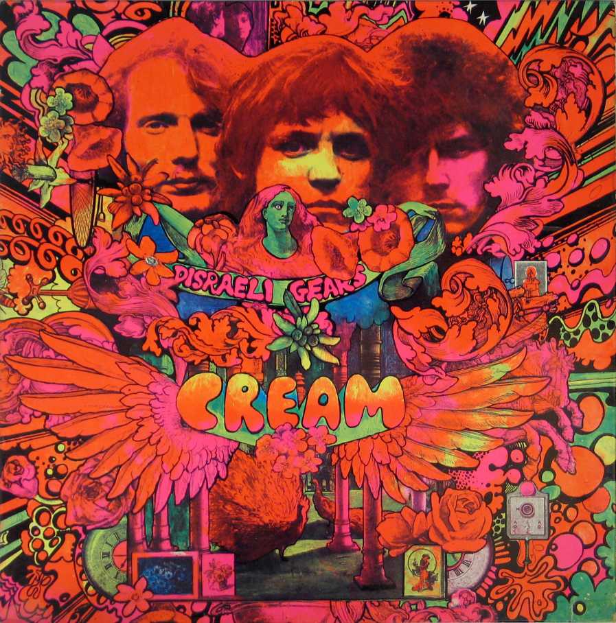
Idea generation; during this process of image making, trying to make more dynamic and engaging compositions and figures, and listening to Murakami's playlist, a new idea sparked to life. Taking into account previous ideas of the 60s era and connections with Murakami and music, I thought about designing these images as album artwork or gig posters inspired by the 60s 'free love' music movement.With the mixture of literal images and surreal 60s physc inspired font I felt like my images were finally starting to reflect a fresh side of Murakami that hadn't previously been explored.

Connection//Input from research;  as a young man Murakami spent a lot of his time surrounded by music. Working for a time in a record store, (as a few of his characters do throughout his literature) he was massively into jazz music; a reoccurring theme in his work, as well as a constant inspiration in the way he writes (free form, immediate, spontaneous, improvised).

Current thoughts//development; I've started thinking about the series of prints as a series of gig posters or 12" record sleeves; that come together to provide a portrait of Murakami//his work. The pysch look of 60s music gives the work a fresh look while still retaining adult themes and sense of rebellion I've come to admire.


Wednesday, 25 November 2015

Gertie Harry; Final Alterations & Finished Image

Final Image (Right; How page will appear in zine)

Text & Aesthetic 

When the client got back to me with a chosen spot character I spoke to him about the additional text he wanted to be added to the image. Given that my piece was going to be included in an independently run and produced zine, he wanted the image to feel a little like that too in the attitude of the image. A  mixture somewhere between indie music zines and a high end celebrity front cover. 

With this in mind I wrote out a few article headlines geared towards a primarily female, music industry interested audience. The client also wanted a name for the magazine, and after a process of elimination, decided upon GURLZ. It was important the aesthetic of the magazine matched with the strong female mentality of the Gertie Harry character. Too ooze a degree of sex appeal and edgy-ness; music meets glamour.

Composition & Final touches

Compositionally I looked back at some magazine covers to help with the positioning of text and how it would interact with the image of Gertie. I looked at magazine covers such as Vogue, Rolling Stone, Vanity Fair, Cosmopolitan ect to see how the text was layered with the image. Given that Gertie was of central focus in this image it made sense for her to sit in the centre of the frame with slight text overlaying her. The addition of a barcode and slight touch ups of the image finished it off; with the image complete I sent it to the client for it to be placed in context of the zine!

Saturday, 21 November 2015

Gertie Harry Brief; Colour & Compositions


Development // Client Talk

Once the scamps had been sent off, the client picked out the two he felt worked best and allowed me to go with whichever I felt was stronger to take through into a digital final image. I personally felt as though the second choice (see issuu document above) would work best at an A5 format showcasing both a strong female pose and allowing for a stronger shape // silhouette driven piece (would work better at A5 smaller format rather than something heavily detailed being printed). 

Media // Colour

The client has stated earlier that he thought it would be nice if the image was done digitally rather than analog. He referenced a previous piece of mine he had seen online and suggested a similar technique to be applied for this image. With the media chosen I decided to work with a limited colour palette so the piece wasn't overly busy and the focus would still very much be on Gertie. Choosing a turquoise // blue for her hair, I then picked a complimentary pink for the other spot colour. At this point the client was still unsure about what text was to be included in the final image, so I played around with her name and how that could appear on the cover. Given I was unsure what further text would be added to the piece I mocked up various compositional examples to send over. The text was to be hand rendered so I tried to keep to a bold sans serif that would stand out amongst the image without overshadowing it. 

Tuesday, 17 November 2015

After Effects Examples

Success from Hannah Jacobs on Vimeo.

When looking for examples of After Effects animations that I liked, I found that simplicity was often the key. A lot of the animations looked a little thrown together, and the ones that seemed most professional and engaging usually didn't over complicate the animation, composition and colour palette.

'Success' by Hannah Jacobs, really utilized sound in relationship with the moving images in a way that felt very, well, successful! The movement and transitions from one image to another was complimented well and made for a stronger piece of work when paired with sound. To watch the animation with no sound, a lot of the transitions and movements from one frame to another seem rather simple. However I am aware that the smooth flow of these images does seem to use frame by frame animation, something our brief does not permit.

The limited palette also shows what can be accomplished within animation using only a few colours! Something that will be helpful in my work later on!


EMARSYS MOTION STORY from Giant Propeller on Vimeo.


Whereas the previous animation was very narrative driven with voice over and sound effects really bringing it to life, this piece I found based around DNA branding is quite different. What struck me most about this piece of work was how well the music fit with the movements of the abstract shapes on screen.

The use of negative space also accompanied the whole atmostphere very well I feel, and again limited palette makes this piece of work feel less clumsy and thrown together and more considered and clean cut.

It has also opened me up to the idea that my sting doesn't have to narrative driven and could be more abstract, perhaps using motifs from Murakami's work? It it something to consider as I go further into this project.

Monday, 16 November 2015

Tutorial Feedback and Thoughts


The tutorial today helped inspire some new ideas! It was suggested that I look over past work such as the first page I did in response to Murakami during summer, and my woman with trees (see images below) and consider how they are reminiscent of the 60s era (Beatles front cover//60s fashion) this perspective (time era) helped get some fresh ideas going!

Relevance; given Norwegian Wood is set in the late 60s and Murakami's work is very rebellious (disregarded traditional Japanese literature // values) the 60s era seems to encompass a lot of what influenced his work // is apparent throughout his books

Media; the response to my dip pen cat has also been very well received (both in crits and online), so it was suggested I work further with that media; the expressive line weight not only made the image aesthetically pleasing, but also links in quite well with oriental line work, suitable given Murakami’s Japanese ethnicity.  

Sunday, 15 November 2015

Gertie Harry Brief; Initial Sketches

Brief

Who: Alan Snapper
What: A5 digital JPEG full colour CMYK
When: 1//12//15
Context: Magazine cover style illustration to be placed on a single page spread of independently produced zine that acts as a 'tour booklet' for the Gertie Harry character
Media: Digital (photoshop) No computer rendered text

Intention // Mood

Before starting this brief it was important to me that I understood exactly what kind of character Gertie Harry was and how Alan wanted her to be presented. I was provided with a character reference sheet for visual aesthetics but how the character Gertie was to be read would highly influence how I went about illustrating her.

After a few messages with Alan it was clear Gertie was to embody the strong sexy female power figure similar to that of Nicki Minaj or Beyonce. The client wanted a bigger bodied female that appeared sexy without being sexualised and vapid; glamorous but edgy. 

References and considerations while drawing

As I began drawing I looked at references such as Minaj, Amber Rose and Beyonce. For extra help in drawing women that were curvier and bigger bodied, who still oozed sexy body language, I looked at some glamour model shoots, trying to find the balance between the power of their sexuality with the confidence and integrity of female celebrities. 

Given the two week time scale of this brief I tried to keep my scamps quick and bold. My main concern at this point was to get down body language and attitude to ensure it would fit with what the client wanted; knowing these were just sketches allowed me to not worry about being too precious with lifework and getting too caught up in the details, thinking slightly about composition as I went along.


Gertie Harry Scamps

Thursday, 12 November 2015

Made You Look

What I Liked

I enjoyed the duality explored in this film with regards to the digital VS analog approaches to both making and distributing work. I think the internet now does play as bot ha positive and negative in many illustrators work, and while there is a need, and gain, to be drawn from having an online presence and knowledge, I enjoyed the refreshing notion that going outside to the real world is also still very much an experience to relish in with it's own experiences and positives to be gained. The idea of networking and talking to other creatives will be something I'l experience later in the collaborative side of this 503 module; it'll be interesting to see how this works in practice!

What I Didn't Like

Overall I really enjoyed the film and felt inspired and hopeful at the end! I do find it a little sad how much some artists rely on the internet nowadays for things such as reference imagery and research rather than going out to experience things and conduct their own research. In the ever expanding world of the web I feel like sometimes trying to get your work noticed is a little like shouting into a void, and while the internet is very much a necessity in our field , I do feel there is still a place for making real world connections. It would be a shame if this aspect of our profession was lost.

What I Will Take Away

Keep in mind internet presence // how you present yourself as both an individual and a brand

Go outside and feel something! 

Study Task 1 - Brief Selection - What is the Problem?

BRIEF SELECTION

PT1

Penguin Random House UK Design Awards 2016; Adult Non-Fiction Cover Award

When looking at the suggested briefs for this module, this was the first brief that appealed to me. Personally I've come across Caitlin Moran's work before, her strong opinions and down to Earth nature are something I've been very fond of in her writing; the way she is able to portray and tackle women's issues with authentic tone of voice and slight attitude is something I'd love to be able to do within my own work. I've not tackled book cover work before so it would be interesting to see my work in a new format, as far as potential struggles would go I think the worry would be to do something stereotypical or just illustrate her book, I'd have to push through this, however I feel after tackling our current OUIL504 Author brief I could do this with more confidence than previously.

Secret-7

This is a competition brief that I came across at the end of last year. Music, specifically album covers and vinyl sleeves, are something I've recently become very interested in; music has always been a huge influence on my practice and outside life too. The open nature of the brief also allows for artistic interpretation which would be fun to play with. I'm unsure of how many entries you can submit for the brief, if multiple submissions are allowed creating a few album covers could help in building up a body of work for this module. Album artwork is something I am interested in pursuing within my practice and this would provide a small stepping stone into that world. The exhibition at Somerset House also looks to hose a range of styles as well as possible networking opportunities were my work successful.

D&AD New Blood Awards 2016; The D&AD Brief 

D&AD briefs are often a lot bigger and commercial in my eyes which can make them seem a little intimidating. After looking through a few of the briefs (only briefly however as it seems you need to make an account to see the full brief) I did come across D&AD's own brief based around the theme of 'bravery'. The subject matter for this brief is what attracted me; it felt more authentic and morally conscious whilst relating to the design industry. I have a lot of passion for bravery within the design industry which I think I could pull on for this project, however the vagueness and size of the brief is still a little daunting.

PT2

Penguin Random House UK Design Awards

(I think the brief I would most like to do would be the Secret-7, however given that it's not currently live I've decided to unpick my second choice to perhaps undertake until the Secret-7 brief goes live?)

What problem(s) are identified by the brief?

Competing against other books covers of a similar nature
Be able to work both traditionally (book format) and digitally (ebooks//apps ect)
Be striking and eye catching

What is the brief asking you to do about it/them?

Be imaginitive
Create something that is timeless and classic
Easily 'pick-up-able' 
Striking
Good communication of what the book stands for (classic but also entertaining and sunny)

What is the brief trying to achieve?

Create a new book cover for Caitlin Moran that stands out against other book covers of a similar nature
Most likely appeal to women?

Who will benefit?

The Penguin Publishing Company
Caitlin Moran
Women who are persuaded to buy the book?

What is the message?

Something 'timeless' but also entertaining
Grounded in reality and 'down to Earth-ness' but also funny
Relatable 

Who is the audience?

Primarily women
'Contemporary readership'

How will the message be delivered?

Through 'imaginative concept and original interpretation of the brief executed with strong use of typography'

Can you foresee any problems in responding to the brief?

Avoiding stereotypes or making a book cover that's very similar to other books in the same subject area
Making sure the 'message' and 'attitude' of Moran's book is well communicated
They could be looking for a more photography based answer to this brief, though that could prove to work in my favour as something illustrated may feel 'fresh' and 'more striking'

Monday, 9 November 2015

Brief Analysis

Top 3 briefs I'm interested in

Secret-7

Though this brief isn't currently live it's definitely one that interests me a lot. The idea of being able to combine my love of music and illustration is something that draws me to this brief, and the notion of being able to start exploring album artwork as a venue for illustration is something I'd like to look at. The brief also allows for a range of approaches and after looking through past winners I also feel there isn't a strong predetermined tone of voice I would have to incorporate into my own work. As multiple submissions are allowed I could submit a piece for each track; creating a set of seven album covers in total for a substantial brief. 

Penguin Books Awards

After looking through the list of books in the Penguin Awards I feel as though the Caitlin Moran and Clockwork orange books would be most suited to my way of working. I've currently not got an interest in my work being geared towards a children's book audience as I'm enjoying working with more adult//mature themes. I'm familiar with the work of Caitlin Moran and enjoy the tongue in cheek tone of voice she uses to tackle often sensitive subject matters. It would be challenging to see if I could echo that within my own work. 

D&AD New Blood; Fortune Favours the Brave

Definitely the most open of my three chosen briefs, Fortune Favours the Brave appeals to me on a moral level rather than a visual one. With cuts to the arts in education each year I think the importance of inspiring young people to stand up and be brave in a create environment is very important. The scale of this project is a little daunting given that I haven't tackled a 'campaign' project of such a scale before, especially with such an open audience // distribution method(s). Perhaps this brief would be better suited towards collaborative OUIL503 instead?

Brief Analysis; Secret 7 (Substantial Brief)

Given that the tracks for this years Secret 7 have not yet been released I can't focus on specific problems at this point, however the brief itself is the same every year so this can be tackled.

What problem(s) are identified by the brief?

The open nature of this brief works as both a positive and negative. Whilst it allows me to push my work in ways that I want to push it, it also allows for a miscommunication of ideas or concepts from initial sketches to developed outcomes. The work has to connect on some level of the collective conscious of both illustrator (myself) and audience while still being individual and not obvious.

What is the brief asking you to do about it/them?

Respond to chosen tracks in a specific format (size requirements) for a chance to be shown in an exhibition raising money for a chosen charity (this year Amnesty International UK). The work can be an format and after looking at past contributors it's clear that there isn't a specific house style that the judges are looking for; allowing for me to pursue a tone of voice I feel fits with each track without worrying about it appealing to a niche form of illustration.

What is the brief trying to achieve?

To showcase an exhibition broadcasting a wide range of illustration, graphic design, graphic art ect that in turn will be sold to raise money for Amnesty International UK. 

Who will benefit?

Obviously the main benefactor of this brief will be the charity, as the proceeds of the sold art sleeves will be going to them. As well as this the Artists//Musicians chosen will probably benefit from the exposure of their tracks and being linked with something morally admirable. From the illustrators perspective (myself) being added to a list of contributors that has boasted names such as Charlotte Mei, Yoko Ono ect would be beneficial in terms of exposure. The chance to actually go down to the opening night of the exhibition would also provide a great opportunity for networking as well as having another exhibition to add onto a creative CV.

What is the message?

Using art to help people! The fusion of art through records sleeves and music to help raise money for a good cause each year is a lovely beacon of what creatives can do to make an impact on the world we live in and do some good!

Who is the audience?

Appart from musicians and artists alike, the exhibition will be open at Somerset house for a couple of weeks for the general public. This allows for a wider audience to be exposed to illustration and makes it feel very assessable. Given the good cause of the exhibition I think it would draw in a range of folk in terms of gender, class, age, sexuality ect. I don't think any of these things are specific for this brief; it feels as though it is something everyone can enjoy which is refreshing.

How will the message be delivered?

The chosen artwork will be printed onto 7" EP vinyl sleeves and exhibited at Somerset House. After that a backlog of all the chosen work is uploaded online for people to view throughout the year. Folk can buy the album covers for £50 which is given to charity. A small statement (140 characters) is all that the artist is given to describe their work // intentions so the image is key!

Can you foresee any problems in responding to the brief?

As stated previously, finding something that people feel they can understand//relate to but isn't obvious or stereotypical will be my hardest problem to overcome in this brief I feel. The freedom could also cause problems in choosing appropriate media // making the pieces work as a set. It's also hard to know what the judges are looking for given the broad range of previously submitted work.