VISUAL JOURNAL
Continued to explore subject matter, focusing primarily on books rather that Murakami's life (less complicated, creates better work flow)
Decided to have motifs from his most known works carry through all prints to create a sense of connection to his work while putting my own 60s twist on it to draw out the rebellious rejection of traditional Japanese culture
Began scanning some images in and playing around with colour; using contextual references to really add more depth and greater understanding and purpose
OZ Magazine
Contextual relevance to own work; This magazine really took on the idea of freedom and 60s counter-culture vibes. Their bold imagery and colour palettes make them striking to look at. While working in my visual journal I kept referring back to these pieces for their image making qualities; colour and pattern in particular. The halftones would be easily replicated if I were to go with a screen-print method of printing, and the idea of using lots of gradients and overlays could be very effective, it's just whether I have the time and printing ability to make them as high finish as I would like them to be!
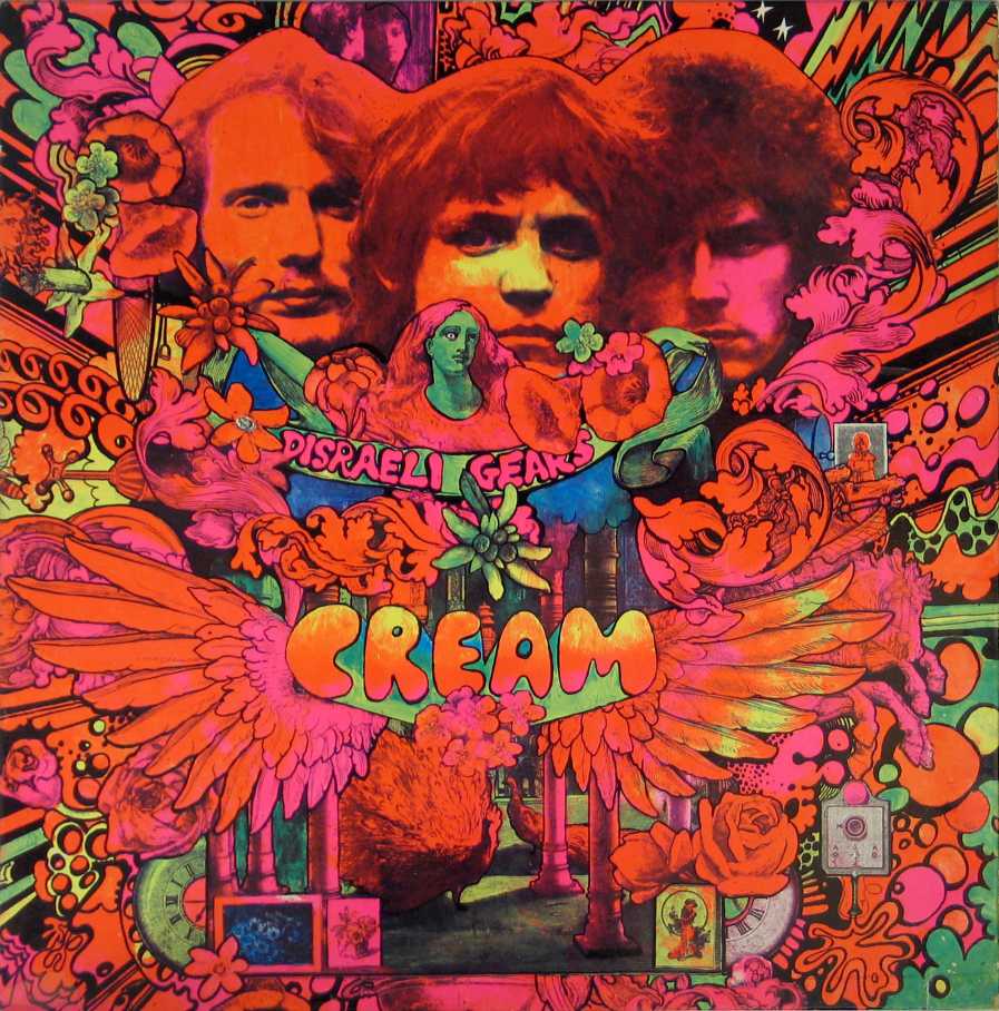
Martin Sharp
Contextual relevance to own work; Again the selective colour palettes in these works really make them stand out and show what you can do with only a few different hues. Looking at both Martin Sharp and OZ Magazine has got me thinking a lot about colours. While experimenting in my visual journal I came across the burnt orange // dark blue palette and, though I'm still open to change, what I liked about these colours was how I felt I had drawn equally from the bold colour juxtapositions of OZ and Sharp but toned them down slightly to encapsulate Murakami's darker and more sober tones - something to keep in mind for further print experiments.
1960s Manga
Contextual relevance to own work; While stylistically and palette wise these images don't seem that relevant to the work I'm undertaking, I'm really glad I took the time to look at them after my crit! There's something about the first and last images above that really plays on the notion of women being innocent and feminine and beautiful while the middle image displays the woman as disinterested or perhaps preoccupied with other thoughts. It's this kind of mixture that Murakami has at times played with in his works. The complexity of women; the contrast in the way they are preconceived to be and the way they actually are. Do I want the women in my prints to all be the same? Do I want them all to be sad an innocent or do I want a mixture to show them to be strong and full of depth? Things to think about!


No comments:
Post a Comment