Tuesday, 28 February 2017

Physical Copy of Independent Leeds & Virgin Media Box Exhibition


Tonight I went to a one night only exhibition of all the painted virgin media boxes for headlingley residents association. It was a really great night seeing everyone and their work, and the residents had even put together to get our paintings printed for us to keep; how sweet.

Whilst at the event I also saw David from Independent Leeds, and he had with him a fresh batch of the latest issue. Inside was the piece I wrote and illustrated for them, as well as a photograph of my box in a feature they'd done on all the paintings for this event.

It's absolutely so great seeing my own work in a publication like Independent Leeds. I think the guys did a fab job of arranging the layout and my pieces look so professional in this context!! I would consider taking on more editorial / reportage briefs after completing this one for I.L. It was a great learning curve, and I surprised myself with how well it all came out. Overall, many happy vibes.

Sunday, 26 February 2017

CMV; Final Image


Once the final image was completed, I set it up as a CMYK file on an A2 sheet of paper with crop marks. This will make it infinitely easier to crop each to the same dimensions and ensure that the space around each edge of the piece is the same. 

Considering I was feeling a little bummed out with this brief when I first started, I'm actually really happy with the final outcome!! I've also proven to myself that I shouldn't avoid totally digital illustration at every cost. I still think I prefer the human element you get when you draw analogue, but digital definitely has it's merits, and working in this way allowed me to complete this brief far quicker than I would have done if I'd have carried on working purely traditionally. 

Saturday, 25 February 2017

CMV; Colour and Text

Left; no text, Right; with text

Using the palette I chose yesterday I started to colour in my image. I wanted a mixture of block colours with gradients to give the piece an illusion of lighting. I didn't want the piece to look too flat overall, and I know solid block colours in digital art can often give that appearance. 

That's where I used a trick I learnt some months ago about easily adding a little texture to your on screen images. Simply using the file>add noise function, speckles the colour out as much as you desire, to give the illusion of a texture surface. I use noise in most of the image aparent from a few of the 'coloured glitch' pixels, as I wanted a bit of variation within them.

Once I'd finished the colouring process, I thought about adding in some additional type. I quite often mix text and image within my personal work as I feel it gives the piece a little more emotional context. It was imperative that the text fit with the imagery, so I spent a while going through dafonts.com to find one that I felt fit best. 

Whilst a couple of the pixel fonts were cute, they didn't feel as though they suited the image as their  were a little too much of an 8-bit style. I finally came upon this font 'Paskowy', which had a slightly more angular and serious tone, with the barcode above the lettering giving it a very digital and computerized feeling. I decided to lay the text out like a barcode on the image, typing the words seen above.

Despite the robotic element, I still wanted the work to emulate and tap into human emotions. The idea of A.I.'s ability to love kept popping into my head, as quite often I explore sentimental human emotions in my personal work. It's hard to explain how I come up with the text as it just feels like something instinctual to me. People generally tend to understand the emotion I'm trying to convey as it comes from an honest place. I hope that translates in this final image. 

Friday, 24 February 2017

Finally some inspo

Loish's art book

This week inspiration came from my postbox.

I recently put an order in for Loish's artbook that came out a while back. Loish is a digital artist and illustrator that works in predominately concept art and character design, as well as completing her personal artwork to sell as prints and merch. I've been a big fan of Loish's work for a long time, and finally being able to see the process behind her work is really inspiring!!

For the first time in a while I turned on my PC and started drawing straight into photoshop using my 500 year old tablet. And it was actually surprisingly refreshing!!! I looked through my own photos until I found one I wanted to use as a reference. I didn't treat this as something super final so allowed myself to play and have fun with it. I actually found that I quite liked the initial sketches and so started working into the piece with a little more detail.

While I started with a woman's head, the more I drew into it the more I started to implement character traits that lent themselves to my pixel/glitch idea. I decided a humanoid/robot woman would be a fun idea to play with; the idea of artificial intelligence going wrong.

I kept focused on the line weight and quality at this point. When I felt as though I had a strong line image set out I began thinking about colour palettes. 

I eventually arrived at the one pictured below. I used a website that holds as tone of pre-existing palettes so just had a scroll through until I found one that I felt fit. I really like the almost 80s vibes I get from this palette, and it feels slightly space/ 8-bit like.


Wednesday, 22 February 2017

Initial sketches for CMV and struggle


I started with some initial sketches in my sketchbook for this brief. The openness of it left me a little stumped at where to start as I feel as though all I've done recently is live briefs that are often dictated at least in part by the client.

I knew I wanted to play around with the female form, so I started by doing some sketches from life drawings to see if any interesting compositions came out of it. I like the idea of glitches and pixels going awry to go with the theme 'out of order' but I'm really not sure what direction, or how I want to achieve that.

In all honesty I'm feeling a little bummed out at the minute, as if I've got an artistic block. I've been working on live and quick turn around briefs for so long I feel as though I'm running out of creative energy a little bit. I really want to be in this show but my mind is at a current blank. I'm hoping inspiration will strike soon!


Monday, 20 February 2017

CMV; Out of Order Brief

The Client;

  • Colours May Vary
  • Andy and Becky

The Brief;

The Rationale;

  • Can show work in an exhibition for over a month
  • Great exposure and opportunity to sell work
  • Chance to take part in a team effort to organise exhibition on our own/ learn a new skill when it comes to organising an exhibition (did PR last year; something new this year?)
  • Fairly open brief, can have some fun making an image for myself after all this live work!! (yay)

Sunday, 19 February 2017

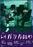
La Betes; development work, alterations and final image


During the process of drawing this final image I made a couple of compositional changes from the initial sketch. I felt as though the image was too text heavy on the left side of the original proposal, and I wanted to balance that out, as well as introduce some more black to the piece so it didn't feel as though there was too much negative space.

I did this through the introduction of a large speaker/amp on the left of the image to break up the wall segment. I then moved the band title to the centre/right and the tour dates and details to the bottom left. I'm a lot happier with this composition compared to the initial one.

Once the image was complete I scanned it in and cleaned it up, editing the black pen lines to be much darker. Once this was done, I began playing with the added texture and where it should go (white space vs black lines) and added in a boarder for the image. I also did one version with a light blue hue over it to see what it looked like with some colour.

At this point Dan messaged me asking to alter a few of the date details at the bottom of the page, as they'd booked a few more dates and wouldn't have the poster ready for some of older ones. This was easily fixable using a light box and another sheet of paper to write out the new dates so they'd fit into the images composition. With this done I tried two more purple/blue gradient combinations with the line work to see how they looked. I feel as though these came out a little too dark however, but I sent them to Dan and the boys non-the-less.

With all the variations taken into consideration, the boys said they preferred the black and white version with the texture on the black linework but a plain solid black boarder. The only other alteration I was asked to make to the finished piece was to make Johns shoulder and back a little smaller (sorry John, haha!!). Once this was done I sent the image off ready for online circulation! 


Compositions for La Betes Tour Poster


Once I got back to Leeds I got started on some rough compositions for the boys. This was a pretty quick turn around brief (they ideally wanted it before the end of the week) so I drew out for compositions for them to chose from. I sent these over with roughs of where the text for each image would go and allowed them to chose the one they felt most confident with.

Getting back to me the same day, they told me they'd gone for John sitting down playing with the deck on the floor. I agreed that I liked this composition and would get started on finalizing the piece as soon as I could.

The live briefs I've undertaken this year have really pushed me in terms of keeping to deadlines and turning images and ideas around pretty quickly. It's not often that I have more than a week or two to get each brief finished, and I think because of this I've gotten a lot faster at getting ideas down without the worry of 'ooo will that work is it even worth drawing' ya just gotta draw it and find out! 

Saturday, 18 February 2017

La Bete Blooms; Tour Poster


Client;
  • La Bete Blooms

Brief;
  • To create a new tour poster for band La Bete Blooms. Will feature a range of tour dates, locations, prices and details. Style; not specified. Size; A4. For digital promotion only so RGB format. List of tour dates and details to be given.

Rationale;
  • I really enjoyed doing La Betes previous gig poster, and so when this opportunity came along I saw it as a great chance to try that way of working again. I also think the hand rendered work suits their sound a lot more than the digital stuff, and they really let me go with my gut tone of voice with these posters which is great.


  • When I got this brief however, I was at home without any of my materials (on a break at home after finishing COP haha). I knew I wouldn't be back in Leeds for another few days so I had a little play on photoshop with the details that Dan had sent me and one of the old band photographs.
  • I knew this little experiment wasn't really going to lead to anything final, and when I sent them to Dan he said although he liked them he preferred the hand drawn stuff; which I agree with.
  • This was still nice to have a little play around with though. These posters feel more lofi and slightly more electronic than the post punk sounds of La Bete Blooms. It was fun to do something different with the imagery too- and though it didn't lead to anything I think I've still taken a little bit from it that I could put into other projects if they came along.


Thursday, 16 February 2017

FINAL VISIT TO V.M. BOX!!!

I finally finished my Virgin Media box!!!!!!!

I could honestly cry tears of joy I'm so happy I've completed it. This brief has really felt like a long and difficult one, but I've learnt so much from it and made some ace connections.

Really when I returned to the old faithful, it was just finishing details that needed doing to complete the piece. It's amazing how much the black line work brought to the final steps of the painting; it really made the piece feel finished and brought into focus a lot of the details and focal points.

I decided not to outline the ferns either side of the box as I really did want the bear to be the focus. Using the black paint on the top of the box helped give some depth to the image, as well as explain the textures there a little more.

All in all this has been a fab project to be a part of. Even though I'm not sure if the style reflects where my tone of voice is now, I think it's a sure milestone in my work this year. It's also taught me a huge number of skills when it comes to larger scale painting, and working with the cold elements of the North, haha!

Monday, 13 February 2017

La Bete Blooms; T-shirt Alteration


Dan got back to me today in regards to the t-shirt design I readjusted for them. It turns out that the company he has paid to create the t-shirts have attempted to screen print the design a couple of times but the lines were too thin. Dan ask if I'd be able to thicken out the lines so he could send a heavy version of the image.

To do this I simply printed out my previous design onto A3 paper, and used a lightbox to trace over the linework using a much thicker pen. I still wanted the image to feel hand rendered, so it made the most sense to do the image this way, rather than going over the lines or manipulating them digitally. 

Once I'd completed the image I scanned it in at 300dpi and sent it over to Dan as a pure black CMYK image. Hopefully they'll have more luck printing with this design rather than the thinner lines!

Thursday, 9 February 2017

FMP; Project Proposal


Seeing as I still have an interest in music illustration, and I'm immensely proud of my home town, it made sense for me to create a brief that allowed me to explore both of these things. I'm hoping to create a series of gig posters that emulate the DIY/gritty Hull attitude within the underground music scene. I think this would be a great opportunity to explore some of the grassroots culture during Hull's year as City of Culture. It also gives the brief a bit of a real-world setting, and given my contacts within the music scene, could lead to some live work?

Updated Statement of Intent

I thought now would be a good time to revise my original statement of intent. I feel as though I've stuck to a lot of my original plans and values, but I've gone more in depth about the professionalism of my practice within this revised version.


Wednesday, 8 February 2017

FMP; Contextual Ref (Daniel Danger)


DANIEL DANGER

- Intricate linework with atmospheric colourwork 
- Lighting plays big part in creating atmosphere
- Crimson Peak work shows how different colour hues can affect atmosphere 
- Consider angle of text (crimson peak)
- Subtle gradient for colour also effective 
- P.O.V. to show composition from? (consider) 


FMP; Contacts and Subject Matter

CONTACTS WITHIN HULL

When it comes to the subject matter of these images I'd quite like to have a range of bands, events, record labels, venues etc in order to show a breadth of the music scene in Hull. I have quite a few contacts within the Hull music scene already, so I'm hoping to utilise that for first hand research. I want my work to be informed so it's of a higher quality!

I thought about asking some of these contacts about the scene in general rather than their personal role in it. That allows me to get some first hand research, without committing to 100% including in individuals within the project. (I don't want bands or individuals to think I'm going to feature them in my posters in case I then have to switch them out for something else).  

Bands

- La Bete Blooms
- LIFE
- Knocking Shop

Record Labels

- Warren Records
- Adult Teeth Recording Company

Events

-The Sesh
- Humber Street Sesh

Venues

- FRUIT
- Polar Bear
- Adelphi 

FMP; Contextual Reference (Switch Open)

SWITCH OPEN

- Freelance Illustration and Graphic Design Company of Nick Rhodes
- Established in Manchester 2004
- Produce limited edition screen printed art prints
- Mixture at times of illustration and manipulated photographs
- Lots of texture and halftones to add detail
- Limited colour palettes or select hues for each image
- Consider borders of image
- Text in relation to these boarders


Monday, 6 February 2017

Independent Leeds; Sending Finals


Today I sent off the final illustrations and words for Independent Leeds. Given that there was no feedback on the improvement of the images, I kept those the same (see previous blog post for each image) and updated the text with Footprint's answers. Both David and John seem really pleased with the artwork and the article itself!! I'm actually pretty proud of accomplishing this reportage work on my own for a live client. I hadn't really thought about working in this field before (post-uni) but it actually combines a lot of my interests (illustrations and making human connections). It's something I'm definitely going to consider moving forward.

Text for the article as follows

When I first encountered zines, I didn’t truly understand what they were. I knew that they were small, independent publications often brought to fruition through DIY means. But what I came to discover through the process of creating a zine, however, was something so much more important than aesthetics. Zines allow for uncensored exploration of personal opinions, issues, and ideas. They allow you a tangible voice in a world now so often reliant on the web, where words can sometimes feel like a shout into the void. A young girl called Jennifer said in Hillary Carlip’s Girl Power: Young Women Speak Out that “Sometimes paper is the only thing that will listen to you.”, and I believe this statement carries with it some truth.

In today’s political climate, it’s hardly surprising that females around the world are returning to 90’s born fem-zine culture. With their origins in Washington state, female zines were created as a backlash against the sexism and misogyny present in the American punk scene of the time. As the movement grew, mixing feminist opinions, music and zines, the subculture of the Riot GRRRL was birthed. While the introduction of technology and the Internet to preexisting zine culture has, at times, threatened the production of print based zines, it has also allowed the movement to evolve and reach a far broader audience than its 90s predecessors. 

As zines allow for unedited and uncensored exploration of personal issues, they provide a perfect initiator for communication in women’s concerns. The intimate creative process of making a zine, in turn, makes them artifacts of uniqueness, each crafted with the purpose of having something to say and saying it. Their individuality defines them as stand alone pieces of artwork, and yet their shared experiences links them together with a strong sense of community.

Within Leeds, I reached out to local zine printers and enthusiasts Footprint Workers Collective. I asked them about what they do down at their DIY headquarters. “We print a lot of zines and sometimes collaborate with zinesters who want to print their own material - skillsharing a little, if you like. We also run a small distro which we use to help promote projects we like.” As well as hosting two zine fairs at Left Bank Leeds, Footprint also previously organised events at Wharf Chambers and made an appearance at Leeds City Museum for International Women’s Day, last year. Speaking about the community aspect of zines, Footprint noted their accessibility as unedited artform. “When people get together to read, swap and sell zines it's a bonding experience. Zines are tactile, and they provide a way of exchanging ideas that isn't disembodied and disconnected. They're also an accessible art form, as they're cheap enough for most people to buy.” While female zines may be gaining momentum in their coverage, as a medium they've been around for some time. “I think we've always printed for a lot of women - I don't think we've seen a particular increase. But there have recently been a number of zine fairs and exhibitions organised by women.” Current affairs may be encouraging these female zinesters to rally together and support their collective cause.

One of these such groups are Scream Zines, created by founding members Ru Bru and Holly O’Brien. They provide a platform to “promote zine-makers and try to spread the zine gospel, basically.” Half based in Manchester and half based in Leeds, the duo recently put together an event at Hyde Park Book Club which included a panel discussion on ‘first zines’, a workshop, poetry reading, open mic, and live music. I asked the two how they felt about the sense of community within female zine culture; “We have experienced a really welcoming and friendly community. We think it's special because women are often taught not to aspire to fulfill their creativity and blocked out of more conventional routes, whereas any women can make a zine and express what she would like to see in the mainstream media.” When discussing their collective ‘zine making workshop’ run at a couple of their events, Scream Zines wrote “We are also continually surprised by how easy it is to relate to people's zines and feel a shared experience.” It is this shared experience that regularly leads zine creators into collaboration. Communal ideals often bringing various women together, to create a publication that speaks out to a diverse audience.

Covering themes from body image to equality, relationships to societal expectations of women; these zines offer an intimate look into the trials and tribulations of today's modern women. Often funny and warm, sometimes tear-jerkingly honest, what strings all these female zines together is a sense of authenticity and need for expression. Footprint spoke out and said “One of the great things about zines is that they enable people to experiment and rethink, to articulate ideas that are important to them. You can work on yourself, your feelings, your links with others, your politics and also branch out into networks of community.” Scream Zines echoed this statement; “By documenting your experiences and relationships you come to know and understand yourself more deeply.” Ladies of Leeds, maybe it's time to make something with feeling.

FMP; Contextual Reference (Prints of Thieves)

PRINTS OF THIEVES

- Leeds based screen printing service
- Specialise in gig posters and art prints, est 2012
- Printed by hand
- Consider screen print as a form of printing these prints? Wanted to print them digitally for ease but worth exploring screen print options? Digital versions of posters vs CMYK versions? Consider colour overlay
- Texture on layers helps separate block colours up a bit so they look more detailed and considered
- Halftones give different colour values
- Again largely selective colour palette 

Waves; Tommy Davidson

Fucked Up; Lurk and Destroy 


FMP; Contextual References (Black Dragon Press)

Following my tutorial with Teresa on Friday, I decided to take a look at some of the contextual references we discussed looking at for this project. I really want my final design pieces to look professional and well made. I'd like to push my composition and colour skills in particular for this brief. I've found through all the live projects I've been doing I really enjoy doing linework. I've been exploring this were I can but this brief allows me more time to really get to grips with it. I'd like to look at drawing my images out in hand-rendered linework and colour them digitally. I'm excited to experiment with this process!!

Looking at pre-existing examples of poster design is something I believe will be integral to this process. I want to look at new ways to push not only the composition and colour of my images, but to integrate elements of design too (typography etc).

 BLACK DRAGON PRESS

- London based company specialising in limited edition 'prints and more'
- Est. 2014
- Range of styles
- Colour often used  to create strong sense of atmosphere 
- A lot of prints are limited palettes // hues
- Intricate line art mixed with selective colour so the images don't seem over cluttered or too complex 
- Consider placement of text when scamping composition 
- Colour of text to fit with imagery 


(Left to Right; Victo Ngai, Teagan White, Johnny Dombrowski)

Saturday, 4 February 2017

Independent Leeds; Sending of Images and text to date


Today I sent John and David a rough of what I'd written so far as well as the images.

They loved the illustrations, however a point was raised they my writing didn't include any quotes from Footprint Workers Collective. I explained to David that I'd emailed them using the address he'd provided me with and not heard back from them. David seemed a little disgruntled about this, but on behalf of Footprints none-reply rather than me not writing them in.

David got in touch with Footprint himself, putting forward the questions that I had written for them previously within an email. Footprint got back very swiftly, so I just need to do a little fiddling about with the writing side of things to incorporate their answers.

Both John and David seemed very happy with the practical work to date however, and didn't request any changes to the illustration side of this reportage brief.

Just a little re-writing and the piece should be ready to send to print!