Friday, 27 February 2015

Greetings From; Artist Research


ARTIST RESEARCH

Owen Davey 

What initially drew me to Owen Davey's work was his selective and appropriate use of colour within his illustrations; they not only work harmoniously together but they help to inform the image and give more context in a subtle way. The bright and bold hues also give the pieces life and vibrancy, they describe the things they are illustrating through translation and tone of voice rather than merely transcribing them. 

The gradients and imperfections in his works also give them a sense of tone and texture that I really like. The way he employs composition within images also provides a design solution to a problem as opposed to a purely illustrated one, which is something I will have to consider in my own work whilst undertaking this brief.

Sunday, 22 February 2015

I See Faces; Evaluation of GIFS

Three final GIFS

I chose these three GIFs as my final ones to submit as I felt they were not only the most successful but also showcased a breadth of image making techniques I'd employed as part of my GIF making. 

The first GIF I made (bottom left) proved to be really well received in the gifs galore showcase we had today, a few people voted for it in the 'most emotional' category which meant that it achieved exactly what I wanted it to. I feel as though it's subtlety and simplicity also worked to it's advantage; something I learnt throughout this project was that the subtle actions and expressions could be just as succinct in exploring and expressing character as multi-frame GIFs that were very complex in movement and construction. 

In a similar way, I liked the small movements of the fox GIF (bottom right), however if I were to undertake the task again I would have liked to include more subtle movements such as the twitching of a tail or the ear. It would also have been beneficial to further push gesture in this image to really emphasise his character; perhaps a hunched over back if he were to appear sneaky, or crossed arms and a straight posture if he were to appear stern. As he currently stands, also a slight sense of his character is implied, he is for the most part passive and not as believable as he could have been if I'd had the time to develop him further.

My final GIF (top) was something really new to me in photographing my illustrations so as they appear 3D. I included this as my final GIF as I learnt a lot through the process of creating it. Firstly, picking the right environment for the character to occupy is important. I chose my windowsill as it's light and mostly white//pale in colour. I also wanted the plant in the background to imply at depth and add a splash of colour. It was also a rainy day when I shot these photos which fit well with his despondent mood

The movement of the arm was something I would have liked to improve on if I were to undergo this task again. It was hard to move as I had to keep sticking his arm down in the right position with white tack, it was also hard to keep the camera in the same position while doing this, though I do quite like the slight movement in camera positioning as it feels very authentic and hand-crafted. 

It would have been nice to attempt this GIF again but with a camera tripod to keep it in the same position, and fishing wire around the fawn's arm for easier and more fluid movement.


I See Faces; Week 3 (GIFs Cont)

 
GIF in photoshop with layers//Final GIF

Building on from my first GIF I began developing some of my other storyboards into final GIFs. The above GIF was created in a similar way to the first one as I really liked the hand-rendered aesthetic to fit with the character, only this time I used acrylic paint as a base colour and repainted it as many times as necessary for the frames so that the colour provided some movement as well.

 
GIF in photoshop with layers//Final GIF

One of the characters I did think about developing further into a GIF was my smug window letting in cold air. I wanted to try out creating the images purely in photoshop, however found that the faces didn't actually work that well in conjunction with the window movement. I decided to drop this GIF as it wasn't working as well as I knew others would and the character wasn't one I felt overly fond of.


 (Left) Layers of fox//different body parts (Right) Layers of final GIF

GIF at 0.0 seconds between images and 0.1 seconds between images


GIF at 0.5 seconds between images and final GIF at 0.1 seconds

I was however determined to make a GIF through purely digital means that did work well as both a piece of short animation and character. My fox provided the means to achieve both of these things whilst also allowing me to attempt a more ambitious movement other than facial expression.

I found while constructing this GIF that timing is something valuable to be considered between frames. As much as I didn't want the leg movement to be too fast, I also didn't want it to be too slow as it made the GIF look laggy and sloppy. 

If I were to do this GIF again I'd add more movement in his body, tail and ears. I would also extend the amount of frames to allow for a smoother run of the background.

GIF in photoshop with layers//Final GIF

GIF in photoshop with layers//Final GIF

During the run of this brief we also had a monoprint induction. I went to the workshop with my characters in mind and thus resulted in the two above GIFs. I knew creating a GIF purely from the actual end results of monoprinting would be difficult so I kept the movement very simplistic just to play with the idea (as seen in top GIF). 

The textures created at monoprint were something I really liked however, and could be rather easily manipulated into a simplistic character design to move as a GIF. For the bottom GIF I mixed together the textured monoprint and digital drawing to result in a subtle but I feel effective character based GIF. I kept in mind the shift fox I'd drawn earlier and tried to imbed a little of him into this character. I added text as it was something I hadn't yet animated.

I also added in some movement in the digital brush strokes I used to colour in his shorts, as I felt it gave the GIF more overall balance

GIF in photoshop with layers//Final GIF

For my final GIF I wanted to try out some 3D papercuts like those of P.Rice. Positioning the character to sit up, stay in the same place and move the hand up and down while keeping the camera semi-steady did prove to be a little bit tricky, however for a first attempt I was pleased with the final result!

I See Faces; Week 2 (First GIF)

GIF layers in photoshop

Towards the end of the week I wanted to try making a final GIF; something simple so I could understand the process and practicality

I wanted to work with analog media when creating the fawn GIFs in particular to give them a hand-drawn and therefore HUMAN aesthetic 

I found the process of GIF making to be surprisingly easy and quick to pick up. One feature that I felt worked very well for me and the brief was to reuse images more than once in the GIF sequence in a mirror effect, this ensured that the GIF looped smoothly and also saved time redrawing frames to get back to the beginning. I'm also rather pleased with my first GIF as it achieved the emotional quality I wanted it to, I especially like the quiver that the hand-drawn line gives to the character and further amplifies the sad fragility I wanted the fawn to encompass 

Sad Little Fawn GIF

I See Faces; Week 2 (GIF Plans and Peer Feedback)


GIFs by Philippa Rice

Though my images created during the first week were indeed 'characters' I felt as though they LACKED character; I feel as though the most interesting characters are created when they have a believability to them, something only really achieved if the illustrator puts their own certainty and conviction into them. I didn't see any of my characters as real living things with quirks and personalities; they felt as two dimensional as the pages they were on.

The work of illustrator Philippa Rice did however reinvigorate me. I love their simplicity in the fact they're usually only 4-20 frames long, but how utterly believable they are. I saw these characters and wanted to know more about them, I got a sense of WHO they are not just WHAT they are. The idea of doing something three dimensional is also something I've been wanting to try out, and her artwork provided perfect inspiration.   


Further character exploration//experimentation after Jon Boam workshop

I began with the intention of developing some of my earlier characters, but I felt no emotional response to really any of them, so given the openness of the brief I decided to employ what I'd learnt at the Jon Boam character workshop and draw without thinking of concept but rather character. 

From these looser concepts I uncovered a little fawn character that made me FEEL SOMETHING. This was a turning point as I felt as though I'd finally created a /real/ character. Through further drawings I began to understand him and his sadness, I wanted to use gesture within my GIF to show others this. 

From the shape experiments I also found myself drawn to a particular fox head that I'd created. Again what drew me to him was a sense of feeling an emotion; a believability. 

 
Sad fawn development and GIF ideas

Papercut fawn experiments, with folds on arms and legs for movement


There were a select few characters from my initial studies however that I also considered developing further into GIFs, they were a mixture of characters picked out to be interesting when we had our crit and characters I felt emotionally excited me.

 
 Storyboards//GIF plans

 Storyboards//GIF plans

 Storyboards//GIF plans

PEER FEEDBACK ON GIF PLANS//CHARACTERS

-Get sad (further become the character, get even more of a feel for him, his likes dislikes, his sadness and how he acts ect)
-Smug window, sad fawn, sneaky fox (the characters that went down best with my peers, consider further development of these)
-Three versions of same character? Different medias? (The fawn went down particularly well, three of him to work as a set?)
-3D fawn, try different sizes (Experiment more with paper cut outs of fawn for scale ect)
-BECOME THE CHARACTER


I See Faces; Week 2 (Character Workshop with Jon Boam)

Characters drawn during workshop with Jon Boam

While I found this task amusing, I would suggest that the most useful concept taken from it was that a character can be born from anywhere; concept driven or not

I feel as though my strongest characters were born from the shapes I was given and instructed to give character too, without being tied to an idea or concept it was easier to be free and much more playful with my character design

It was also useful to be given the shapes by a classmate rather than make my own as it forced me to adapt and change the way I would usually make characters, in order for them to fit within the shapes in a logical way

WHAT LEARNT

What I got from this task was that perhaps concentrating less on concept and more on character could actually help the strength of my pieces

While INTENT is very important, for this particular brief, I don't think the concept needs to be


I See Faces; Week 1 (Feedback)

Feedback sheet

Overall feedback was positive!

THINGS TO CONSIDER//IMPROVE

-More colour//media experiments; colouring the actual characters rather than just using colour pencils to draw them out with

-Experiment with different features//different ways of drawing eyes//noses//mouths ect. I was glad someone also picked out on this as I did worry some of my characters looked too 'Adventure Time' esque

-Develop characters further; push them more

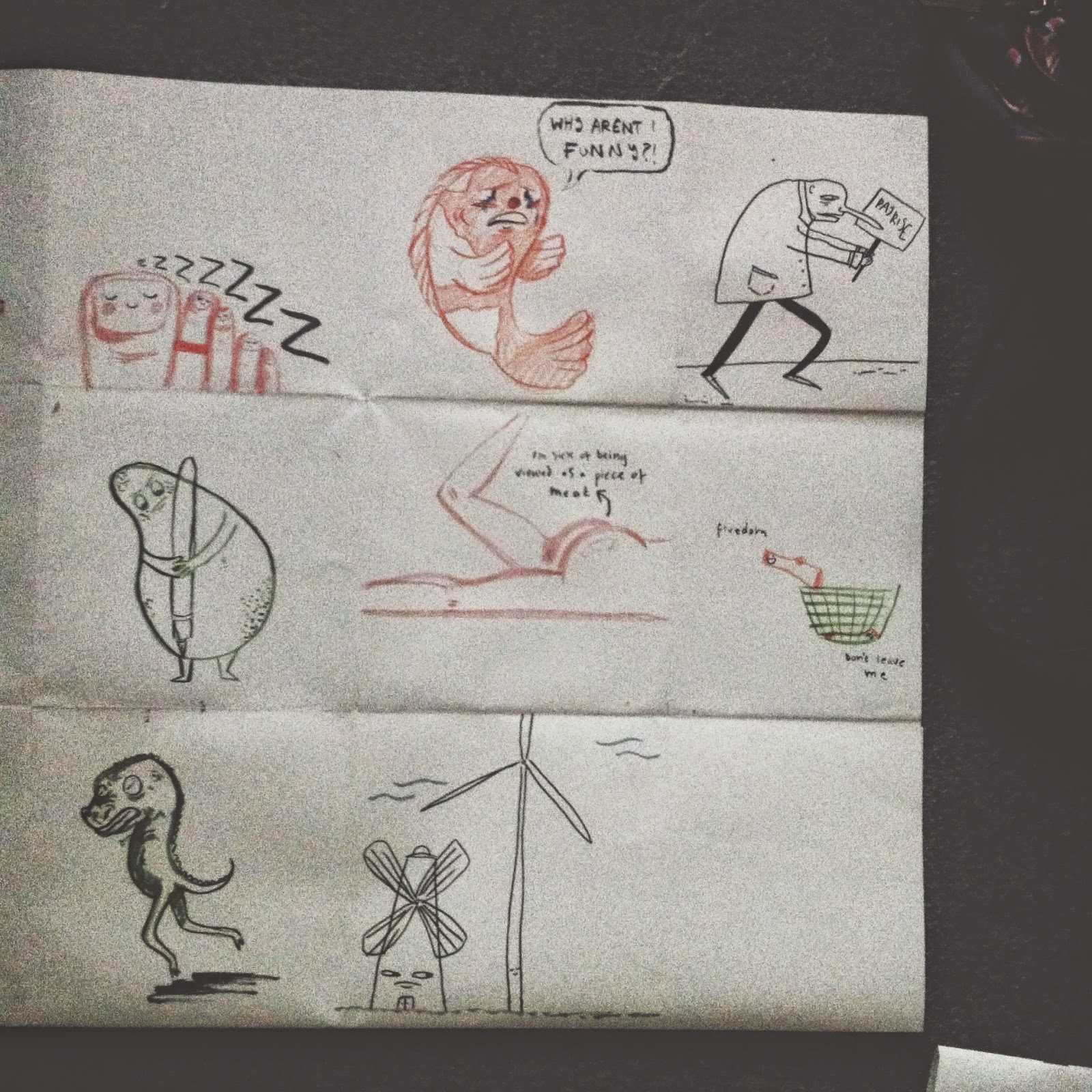
I See Faces; Week 1 (60+ Characters)

 
Front cover and initial listing for ideas

I began with listing a few ideas for the three themes we were given initially, I wanted to use a range of both physical and abstract ideas as I didn't know which would make for the better characters. I found early into the project that the physical themes were much easier to turn into characters than the abstract ideas; although this didn't always lead to the best results.

Adventure Time; The Art of Ooo

Part way through this process I found myself getting frustrated with the images I was creating. I felt that with some of them, the abstract ones more so, I was getting into a habit of illustrating an idea rather than creating a character. 

At this point I reached for some contextual research to get my mind going again, and it came in the form of Adventure Time's Art of Ooo book. My parents got me the book for Christmas but I hadn't really studied it in depth yet. However reaching for it proved to be very useful. I feel as though it took me away from the idea of a character being something that was already alive or real. It made me think about changing the characters into inanimate objects or made up creatures.

Excerpts from sketchbook pages

I found switching up media also helped me in changing how I was thinking about each character. However I still feel as though some of them are more of an illustration of an idea rather than a character themselves. I felt as though it was easier to create characters from the ideas I felt most strongly about, as it was easier to impart my feelings into the illustrations and make them come to life in the form of a character.

 Excerpts from sketchbook pages


Tuesday, 17 February 2015

Illustrator Induction

Basic shape tool on Ai

Use of overlapping//cut out//manipulating shapes

Exported pages as PNG

Playing with shape further